Tag: maps

Abstracting the map
Tung studio in Toronto decided to reinvent the map. The results are beautiful abstract-ish quilts, showing neighbourhoods as ideas. you could not navigate by these obviously, but they are beautiful, understandably map-ish. My thought is that we do not need paper maps anymore, so we are free to reinvent them as ideas and abstract representation of ...
Here be Dragons
You have probably heard the expression, and most likely associate it with images of old maps covered in drawings of sea serpents and other mythological creatures. But what are exactly those creatures living on the margins, and how did they get there? Pack your bags and jump on board. But aware, though, for Here be Dragons. Despite its popularity, there ...

A-maze
Listening to the QI No such thing as a fish podcast, I was alerted to the story of a Japanese girl, while clearing her caretaker-fathers stuff, found this amazing work. Apparently, he spent seven years doing this. I doff my hat. You can buy a print - more on this story here ...

Dangerous tectonic visualisations
Dangerous tectonic visualisations: Visualisations are good things. They should be beautiful to look at, informative and invite discovery. But they can be very dangerous. Visualisations can be used to make decisions, learn something new, connect surprising dots, showing unknown connections. If you want to buy a car, you might find a visualisation that shows the ...

Creative mapping: paper towns, trap streets, cartographic treasure-hunts
Q. Why was longitude boiling mad? A. Because it was 360 degrees. Cartographers are/were often seen as pretty dour characters. Not so long ago, maps were hand-drawn, and hanging over a drawing table, the meticulous of drawing contours seems rather nerdy. But, as programmers put easter-eggs in code, cartographers do the same. Map makers sometimes ...

The world inside USA
Frank Jacobs blog about weird maps is a source of laughs and curiosity. It contains the real, the fictional, the fantastic and the self-made. He found a map of USA with each state named after a country with corresponding GDP, though I would have liked a colour-coded intensity added, it is well worth a study. (I ...

Images in the time of cholera
In 1854 there was a cholera epidemic in London. The accepted theory at the time was that illness and epidemics spread through the "miasma", a form of "bad air", pollution and smell emanating from decomposing organic matter. The mechanics of germs was not understood. Dr. John Snow was sceptical to the miasma theory, but not entirely grasping germ mechanics, ...

David Rumsey collection: mapping history I
David Rumsey's gigantic collection of historical and modern maps, schematics, timelines, data visualisations, diagrams, history, time, sciences, religion is a never-ending source of wonder and inspirations. It is a bit of a trap, as I can spend days wandering around in the magical world of visualisations of history, science, culture, religion. Looking at the older ...
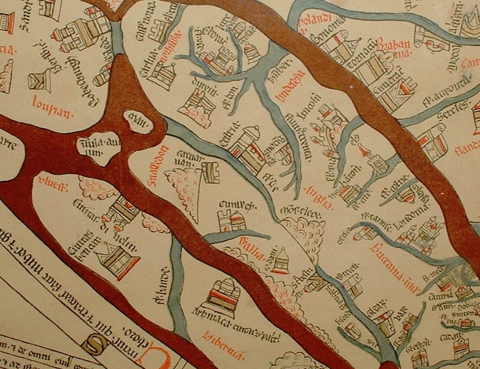
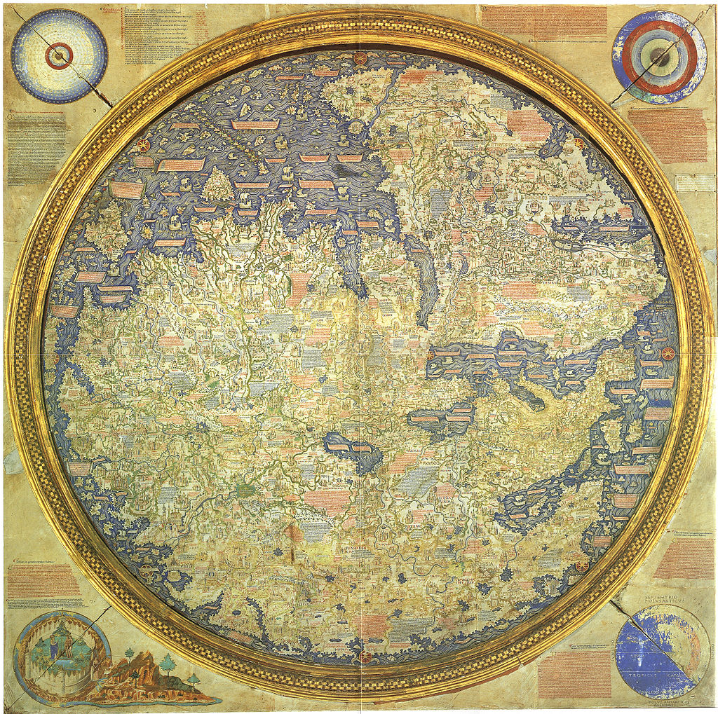
Maps: the time and space of the Hereford cloth of the world
Maps: the time and space of the Hereford cloth of the world The Hereford Mappa Mundi is one of the oldest know, complex map of the world (Mappa = cloth Mundi = world). It dates from about 1285, and are found in the Hereford cathedral. It depicts 420 towns, 15 Biblical events, 33 animals and ...

“Next station! Pituitary Gland!”
Over at http://rangelmd.com/ there is this genius post: Human anatomy as subway map ...
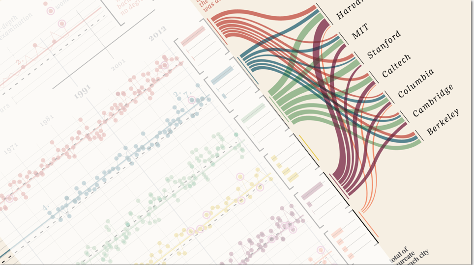
“Design is where science and art break even”
Once in a while I come across some images that takes my breath away, and make me intensely wish that I had thought about it myself. Art can of course do magic, but the combination of information and art, I feel, somehow takes both to a higher level. Giorgia Lupi Has made these amazing charts ...