Category: Complex Visualisation
When visuals gets multivariate and x & y will not do.

Open Science: Map scaled by number of journals published there
Iara Vidal is working on her PhD in Information Science at the Federal University of Rio de Janeiro in Brazil. She is an expert in altmetrics (altmetrics are non-traditional metrics proposed as an alternative to more traditional citation impact metrics). This is what she has to say about access to information: I don’t think anyone would deny that ...

My geologic timeline in the magazine Science & Vie!
A long time ago I made a geologic timeline as a (vector) brush in Illustrator, with .ai and .eps files free for anyone to use. The only thing I ask is that if you use it, let me see the result. Making the timeline was incredibly time-consuming and ludicrously fiddly. So, a while ago I got ...

Dangerous tectonic visualisations
Dangerous tectonic visualisations: Visualisations are good things. They should be beautiful to look at, informative and invite discovery. But they can be very dangerous. Visualisations can be used to make decisions, learn something new, connect surprising dots, showing unknown connections. If you want to buy a car, you might find a visualisation that shows the ...

Charts: the horror of three dimensions
We have really cool tools to make information and data visible, I find joy in beautiful visualisation of complex information. I see, I learn. But here is what makes me furious: three-dimensional charts. Never, ever make diagrams and charts 3D. NEVER. Here is why: Graphs, diagrams and maps are tools to ask questions. Sometimes they are ...
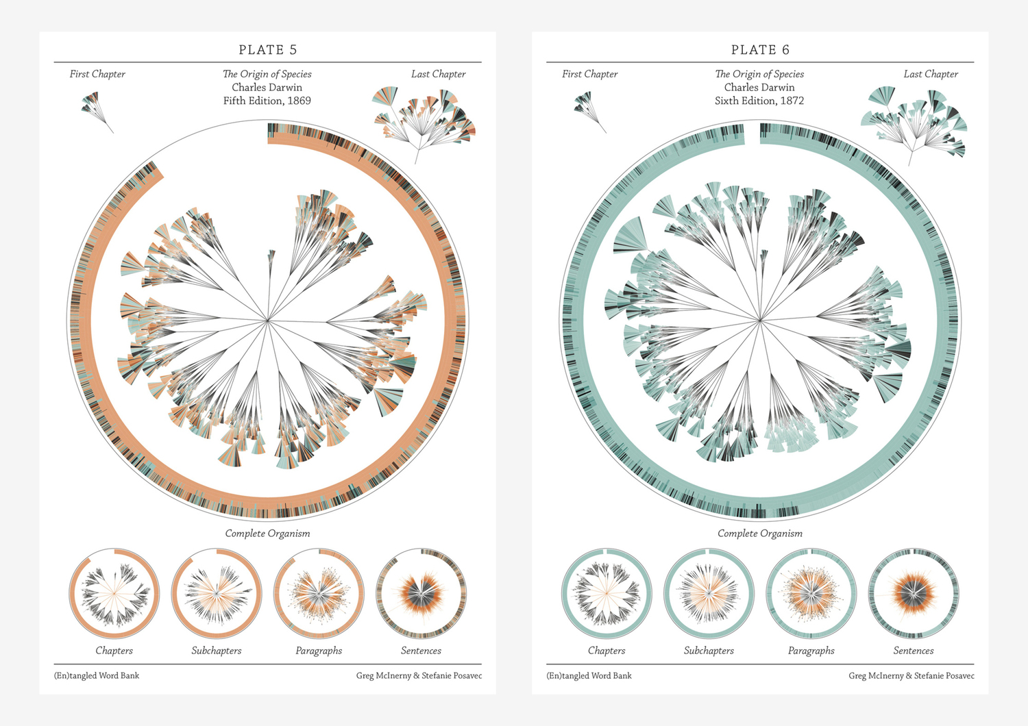
There is grandeur in this view of life – visualising Darwin
If I were to give an award for the single best idea anyone has ever had, I had to have to give it to Darwin, ahead of Newton and Einstein and everyone else. It is not just a wonderful scientific idea; it is a dangerous idea. it overthrows, or at least unsettles, some of the ...
Scalable geologic timeline II
For the geo-geeks out there, I have finished my geologic timescale brush; now better and more accurate than the previous one. Download the Illustrator file here Download .EPS file here Included is a swatch folder with all the colours as per the instructions of the International Commission on Stratigraphy: You are welcome to use this in ...

Design and information
Confusion and clutter are the failure of design, not the attributes of information. – Edward Tufte ...

Creative mapping: paper towns, trap streets, cartographic treasure-hunts
Q. Why was longitude boiling mad? A. Because it was 360 degrees. Cartographers are/were often seen as pretty dour characters. Not so long ago, maps were hand-drawn, and hanging over a drawing table, the meticulous of drawing contours seems rather nerdy. But, as programmers put easter-eggs in code, cartographers do the same. Map makers sometimes ...

David Rumsey collection: mapping history I
David Rumsey's gigantic collection of historical and modern maps, schematics, timelines, data visualisations, diagrams, history, time, sciences, religion is a never-ending source of wonder and inspirations. It is a bit of a trap, as I can spend days wandering around in the magical world of visualisations of history, science, culture, religion. Looking at the older ...
Visual Italian Wikipedia use
I do not read Italian, but I can certainly appreciate these wonderful multivariate visualisations. Valerio Pellegrini made this gorgeous visual representation of Italian Wikipedia use for 2013. Months are distributed clockwise with Italian initial for each month. It has three layers of information and data: the inner level; overall top edits, the second it is ...
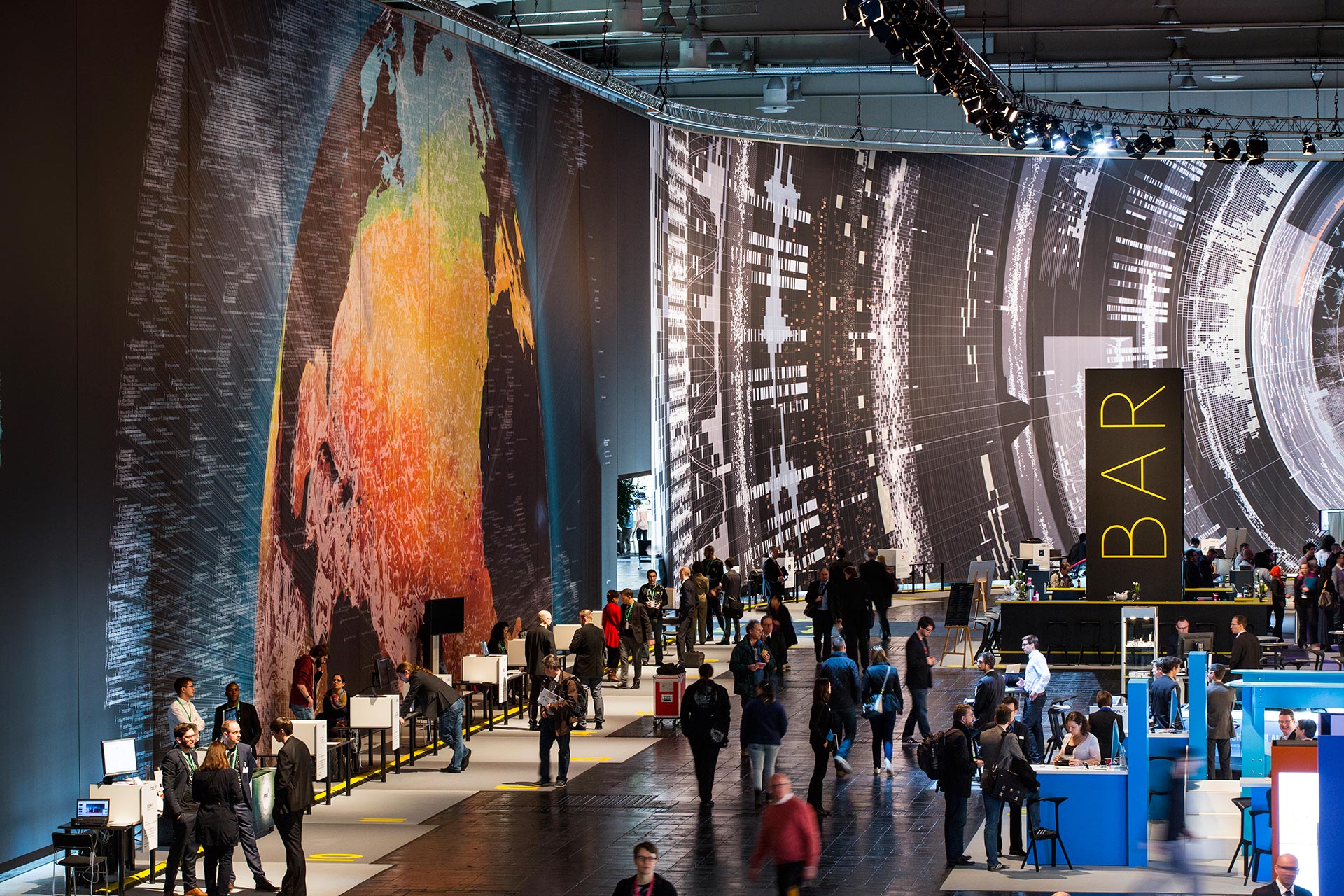
Massive scale, breathtaking data-driven visualisation at CeBit 2014
I sometimes come across data visualisations that takes my breath away. This is one. Created by the design house Kram/Weisshaar for the CeBit 2014 computer expo in Hannover. Wish I was there. It is of course the sheer size that makes an impact, but the visualisations themselves are amazing, the amount of data accessed mindblowing, ...

Visualising data, telling stories
Telling stories that can only be seen. Data visualisations can be extraordinarily beautiful. Here are but a few tools. gephi Open-source desktop application, primarily a network visualisation tool, but with plugins galore for space-time extensions. Gapminder Beautiful, multivariate statistics. See this phenomenal TED presentation by Hans Rosling - love that guy Google charts Not surprising, ...
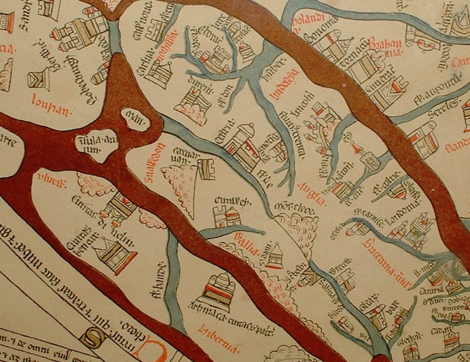
Maps: the time and space of the Hereford cloth of the world
Maps: the time and space of the Hereford cloth of the world The Hereford Mappa Mundi is one of the oldest know, complex map of the world (Mappa = cloth Mundi = world). It dates from about 1285, and are found in the Hereford cathedral. It depicts 420 towns, 15 Biblical events, 33 animals and ...

What is wrong with “interactive information”?
What is wrong with "interactive information"? Displaying information with heavy use of animation, interactions and happenings – why is it wrong? Why does video tutorials drive me batty? Looking for a tip in Illustrator, I find endless video tutorials and it annoys me no end. Why? Because all I want is an overview that I ...
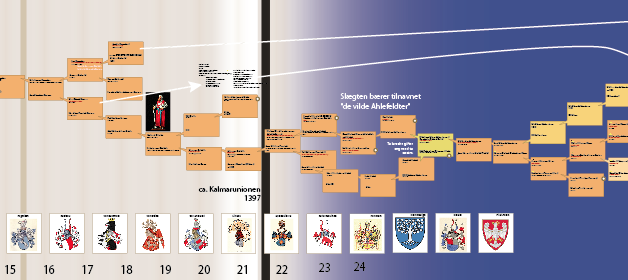
Multivariable visualisation: tracing 40 generations
A while ago, on a whim, i did some digging into my grandmothers family tree. I found more than I bargained for, as described in the post Noble genealogy. And I decided to make a family tree... A family tree of more then five generations soon gets complicated and it becomes impossible to keep track ...

“Next station! Pituitary Gland!”
Over at http://rangelmd.com/ there is this genius post: Human anatomy as subway map ...
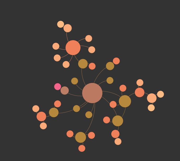
Life network
Take the things that are interesting, and see if you can connect the dots. This is made in Gephi, an open-source network visualisation tool. This will eventually be an interactive browser for my other blog ...

Beautiful statistics
Hans Rosling, the hero of beautiful statistics, showing us the world as it actually is. By making statistics beautiful and demonstrating that the impossible is possible. Oh, and btw; you can play with the Gapminder tool yourself ...
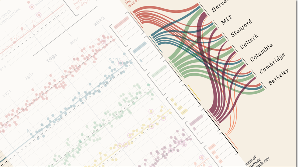
“Design is where science and art break even”
Once in a while I come across some images that takes my breath away, and make me intensely wish that I had thought about it myself. Art can of course do magic, but the combination of information and art, I feel, somehow takes both to a higher level. Giorgia Lupi Has made these amazing charts ...
Visual complexity: in defence of hard
In defence of hard is a splendid post from P.J. Onori, over at Adaptive Path. He argues eloquently that simplifying the visually complex is an affront to the human capacity; that the tendency for treating people like idiots makes us idiots. You are allowed to demand something of people: not everything is simple, and we should ...