Category: Graphic Design
That stuff that is all around.

Textures of Utrecht
I went to Utrecht last year, to meet up with two of the other squirrels, and attend a workshop in datavisualisation with Stefanie Posavec. A few days in Utrecht. You should stay away, so it always stays delightful for me. I am going again in april. Wonderful place. 36 73 tile tile 6 44 43 ...
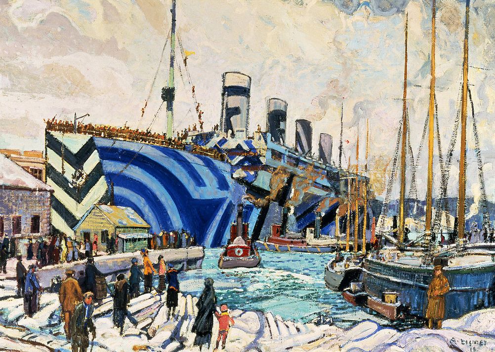
Dazzle camouflage: sea-going Easter eggs and face recognition
Most warships these days are gray, and for good reasons. They are generally more difficult to make out with the naked eye. Of course, these days technology often makes visual camouflage redundant, but during World War I, a different tack was used: dazzle, or disruptive, camouflage. The idea was not camouflage as in "invisible", but ...
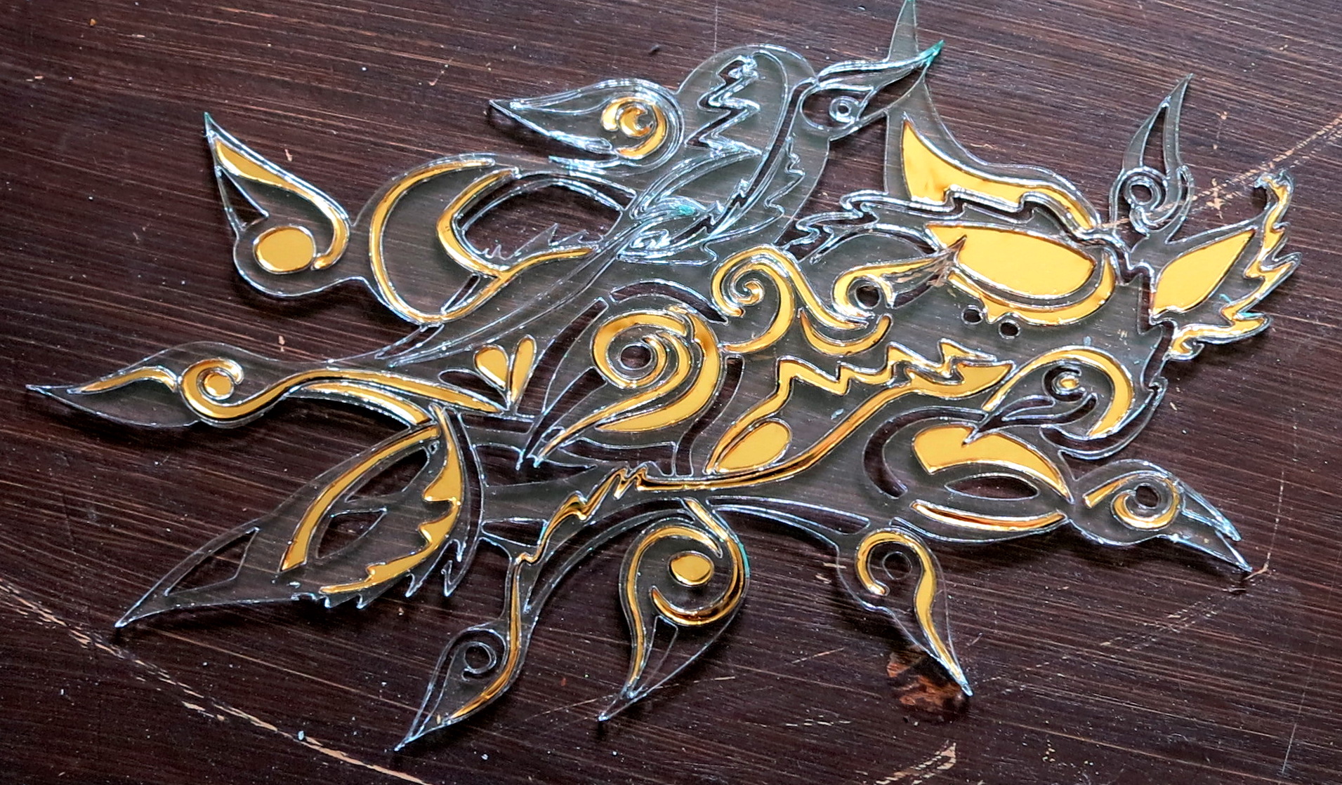
Twelve golden wild ducks – fairytale in smoke and mirrors
There is a fairy tale here in Norway, called the twelve wild ducks. The story is not really important, it a fairly classic good versus evil, patience, purity and deceit. I think it is a pretty convoluted story, and I always found it dissatisfying that there is no attempt at explaining why the princes are ...

Acrylic and wood: into the laser
I have fallen in love with a machine. The laser cutter at the uni. Well; actually, it is what it can do, that captivates me. I am craftsperson – I have two educations in crafts. I am a potter and bookbinder. So I have a sense for materials, how they act, what you can and ...

Saul Bass: Designer of the Seventh Art
Saul Bass is the genius behind movie legends such as The Shining, The Man with the Golden Arm, Vertigo and Anatomy of a Murder. During his 40-year career Bass worked for some of Hollywood's most prominent filmmakers, including Alfred Hitchcock, Stanley Kubrick and Martin Scorsese. It was his work for The Man with the Golden Arm that made ...

Abstracting the map
Tung studio in Toronto decided to reinvent the map. The results are beautiful abstract-ish quilts, showing neighbourhoods as ideas. you could not navigate by these obviously, but they are beautiful, understandably map-ish. My thought is that we do not need paper maps anymore, so we are free to reinvent them as ideas and abstract representation of ...

The network II: drawing meets laser
The network II: drawing meets laser: I made a drawing I told you about n another article, the network (it does not mean anything). The department head in my research group at uni expressed an interest in doing something lage scale on a rather empty wall. A fellow student took the idea and ran with ...
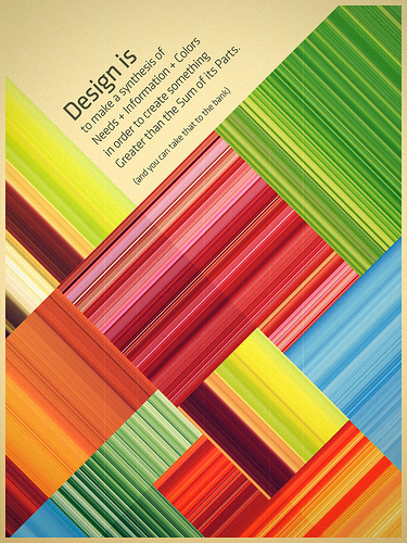
Stealing posters
They say in art the greatest compliment is to be copied, and the greatest compliment for poster design is when your poster gets stolen. It seems that print posters are dying. Now we have digital screens that cycle – for the most part – commercials. Should we care? Are posters merely something arty people and ...

Logo rethink: generative identity
If you have ever even remotely been hanging out on with graphic designers, you have come across the logo discussion. Frankly, it is boring, has no answers, and depends on a huge pile of ifs and depends-ons, but the constant fallback is to general guidelines such as clarity, simplicity, it must work on a ballpoint pen and ...

Calamityware: disaster porcelain
Here at the visual squirrels, we are not in the habit of promoting stuff, but Calamityware is simply too funny. Taking the classic language of cobalt and porcelain decoration, the artist Don Moyer adds – well – calamity. Volcanoes, robots, tentacles, and all manner of funny creatures hide in the china. The only problem with ...

8-Bit Philosophy: Answering humanity’s most important questions in 256 colors
The guys over at Wisecrack have created one of the most compelling videos collections I've seen. The group - a media collective run by comedians, academics, filmmakers and artists - attempts to answer humanity's most important questions using 8-bit graphics and constant awesome game references. The videos themselves are great, with some of the most complex philosophical problems ...
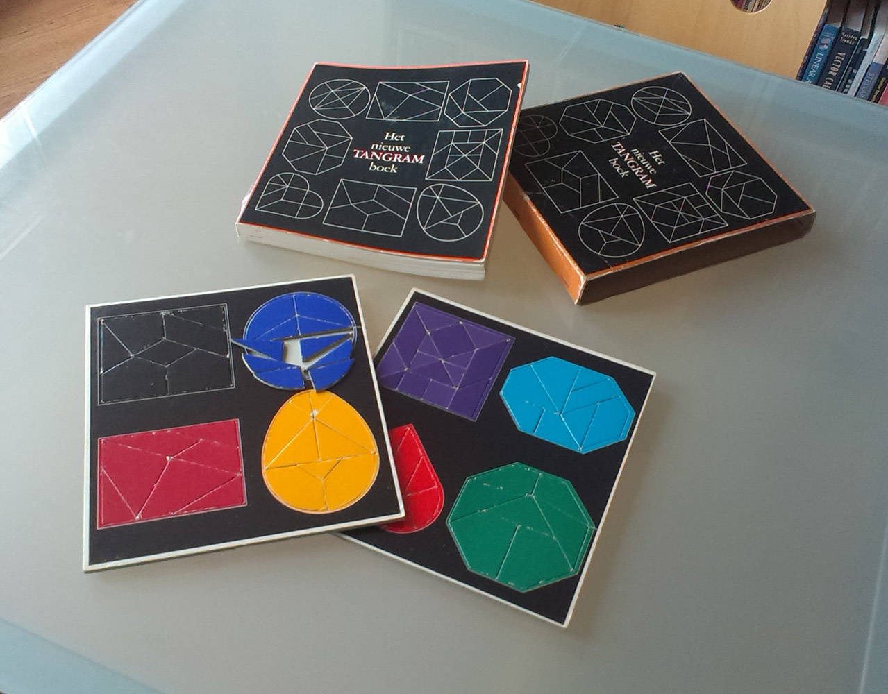
The New Tangram Book
Puzzles have always fascinated me. Language puzzles, escape rooms, logic problems. When I code, I tend to see the coding problem as a puzzle that I need to solve. Especially CSS feels like that lots of the time. Recently, I dove into my parent's bookcase and fished up this old jewel: This 70s book is ...

My geologic timeline in the magazine Science & Vie!
A long time ago I made a geologic timeline as a (vector) brush in Illustrator, with .ai and .eps files free for anyone to use. The only thing I ask is that if you use it, let me see the result. Making the timeline was incredibly time-consuming and ludicrously fiddly. So, a while ago I got ...

Equil smartpen2: phenomenal tool or novelty toy?
I am not into gadgets. The very word implies something useless; perhaps fun for a week, but quickly discarded. A pet hate of mine is the insane amount of electronics made, for stuff that do not need electronics. Waste of resources, batteries, minerals, human costs and filling up insane landfills with rubbish. Enter the Equil ...

A-maze
Listening to the QI No such thing as a fish podcast, I was alerted to the story of a Japanese girl, while clearing her caretaker-fathers stuff, found this amazing work. Apparently, he spent seven years doing this. I doff my hat. You can buy a print - more on this story here ...

You know you want one: science nerd merit badges
Out of the generosity of the Order of the Science Scouts of Exemplary Repute and Above Average Physique I have been allowed to recreate their science nerd merit badges. You can find the indexed list here, or you can go directly to my Cafépress profile. No, this will not in any way make me rich and/or famous, ...

Central Asian art in a couple video games years apart
Video games are getting prettier and prettier. It's good to see that some of them incorporate actual works of art, sometimes in very distinctive styles. Even some old, very old games have had great art direction. Computer gaming is an old love. I had played multiple simple games on my MSX2 starting at age 8, ...
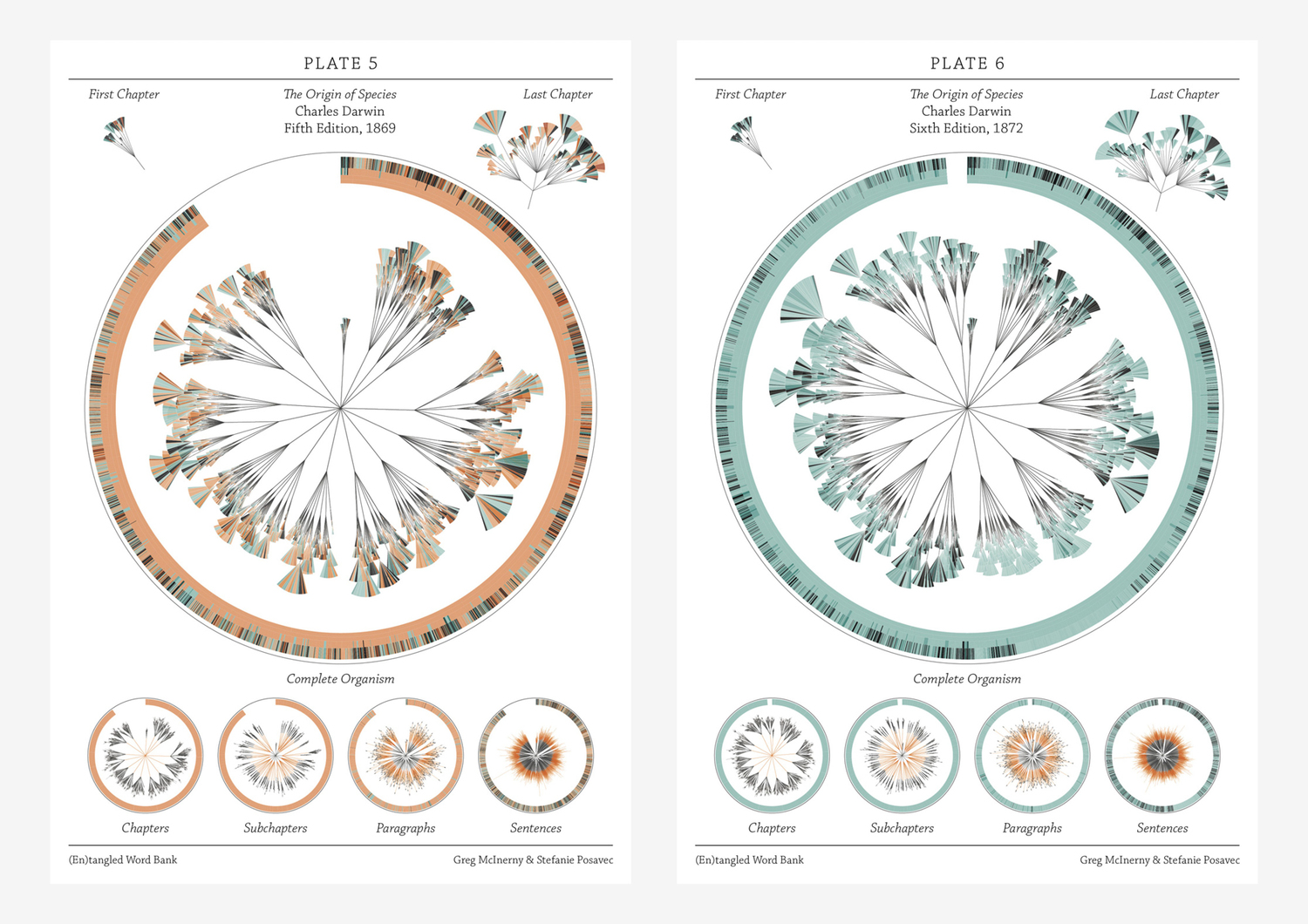
There is grandeur in this view of life – visualising Darwin
If I were to give an award for the single best idea anyone has ever had, I had to have to give it to Darwin, ahead of Newton and Einstein and everyone else. It is not just a wonderful scientific idea; it is a dangerous idea. it overthrows, or at least unsettles, some of the ...
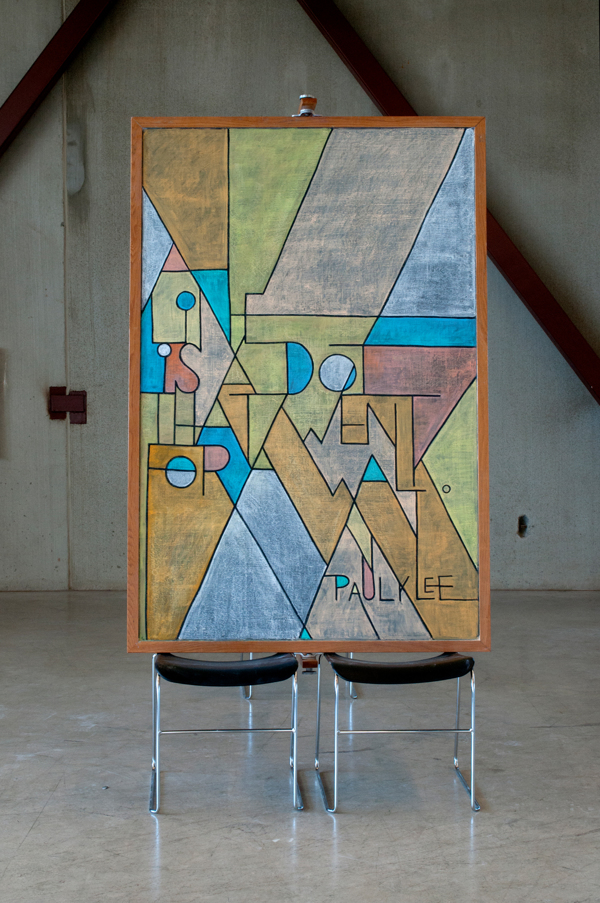
Dangerdust
Came across Dangerdust; anonymous students at Columbus College of Art & Design. Each week they make a new piece of art on a blackboard. Head over to their Bēhance page, and take a look at their stunning work. Here is a quote from Paul Klee and classic from Calvin and Hobbes ...

WPA posters – art in the depression
During an extended period of the depression in USA (between 1935-1942), the US federal government supported artists by commissioning artwork for non-federal places and activities. Early on in the project, posters were painted by hand, each individually created. Later on, they were printed with silk screen. According to the US library of congress, "over two ...

Design and information
Confusion and clutter are the failure of design, not the attributes of information. – Edward Tufte ...
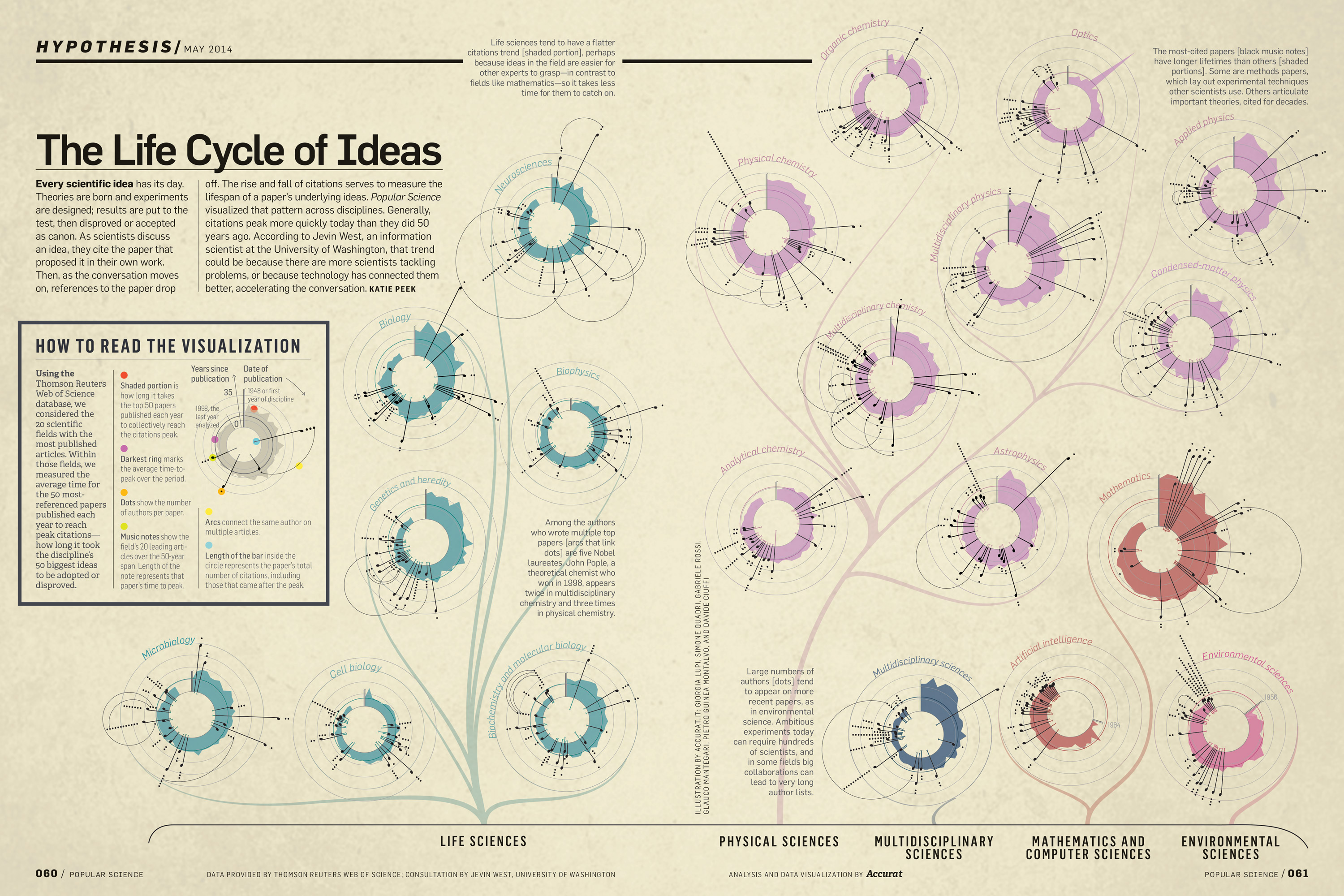
The Life Cycle of Ideas, Accurat for Popular Science
Giorgia Lupi once again comes up with stunning, informative and elegant data visualisation. This time, the life cycle of ideas. You can see another of hers in my post Design is where science and art breaks even ...

Doodles, creativity, alphabets and cognitive noise
‘…qualities like quiveriness and vulnerability come to mind when I think of creativity… creativity requires a sense of smell, a palate to taste the scents that make brilliance. All life feeds upon the random. Creativity is the haute cuisine.’ -Douglas Hofstadter ...

David Rumsey collection: mapping history I
David Rumsey's gigantic collection of historical and modern maps, schematics, timelines, data visualisations, diagrams, history, time, sciences, religion is a never-ending source of wonder and inspirations. It is a bit of a trap, as I can spend days wandering around in the magical world of visualisations of history, science, culture, religion. Looking at the older ...
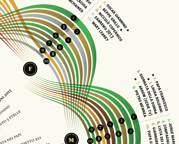
Visual Italian Wikipedia use
I do not read Italian, but I can certainly appreciate these wonderful multivariate visualisations. Valerio Pellegrini made this gorgeous visual representation of Italian Wikipedia use for 2013. Months are distributed clockwise with Italian initial for each month. It has three layers of information and data: the inner level; overall top edits, the second it is ...
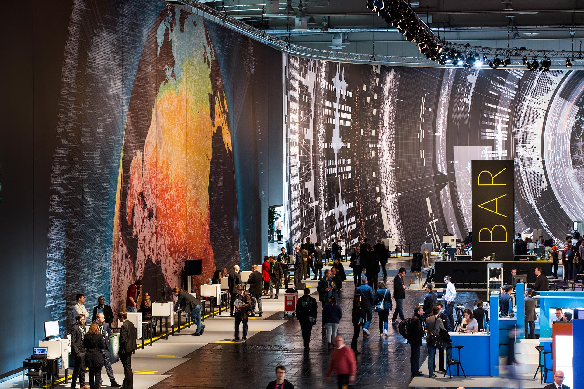
Massive scale, breathtaking data-driven visualisation at CeBit 2014
I sometimes come across data visualisations that takes my breath away. This is one. Created by the design house Kram/Weisshaar for the CeBit 2014 computer expo in Hannover. Wish I was there. It is of course the sheer size that makes an impact, but the visualisations themselves are amazing, the amount of data accessed mindblowing, ...

Diego Mazzeo: mechanical animals
Green with envy, I present Diego Mazzeo and his wonderful mechanical animals. I am speechless; they are absolutely stunning and perfect in detail. I am particularly fond of the insert heart on the dragon, with the magnification in the corner. Inspired! Diego Mazzeo mechanical animals mechanical dragon dragon closeup mechanical raven raven closeup Diego Mazzeo, ...

Visual science: the periodic table
Oxygen tries to play nice with the other elements in the playground ...

Visualising data, telling stories
Telling stories that can only be seen. Data visualisations can be extraordinarily beautiful. Here are but a few tools. gephi Open-source desktop application, primarily a network visualisation tool, but with plugins galore for space-time extensions. Gapminder Beautiful, multivariate statistics. See this phenomenal TED presentation by Hans Rosling - love that guy Google charts Not surprising, ...

What is wrong with “interactive information”?
What is wrong with "interactive information"? Displaying information with heavy use of animation, interactions and happenings – why is it wrong? Why does video tutorials drive me batty? Looking for a tip in Illustrator, I find endless video tutorials and it annoys me no end. Why? Because all I want is an overview that I ...

“Next station! Pituitary Gland!”
Over at http://rangelmd.com/ there is this genius post: Human anatomy as subway map ...
What good old days?
Note: this is a post I wrote a few years ago, but it is still valid. I have been reading Design Observer on and off for a few years. Sometimes it's desperately navel-gazing, sometimes is preaching to the already converted, sometimes it's talking to a few insiders. Sometimes, it is good. The last time I ...

Streetart
Streetart is all around, in the most unlikely places. I implore you, do not just walk past. Stop and sniff the excellence of creativity in the dark. alley turtle turtle kitty banksy-ish marine life ape in the hotel unicorns weird biker war pac-man eh... trumpeter royal creature stikman piece piece gekko gekko good people once ...
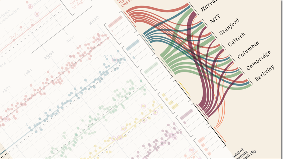
“Design is where science and art break even”
Once in a while I come across some images that takes my breath away, and make me intensely wish that I had thought about it myself. Art can of course do magic, but the combination of information and art, I feel, somehow takes both to a higher level. Giorgia Lupi Has made these amazing charts ...

The importance of doodles
The importance of doodles: I am a great believer in doodles. I am a notorious meeting-doodler, and believe there should be more doodles in the world. I carry around a Moleskine for this purpose, and here are some examples. my left hand doodles big city doodle deck of cards, three of hearts doodle doodle from ...

Visual complexity: in defence of hard
In defence of hard is a splendid post from P.J. Onori, over at Adaptive Path. He argues eloquently that simplifying the visually complex is an affront to the human capacity; that the tendency for treating people like idiots makes us idiots. You are allowed to demand something of people: not everything is simple, and we should ...
