Category: Math & Statistics
Numbers, lies, damn lies and statistics.
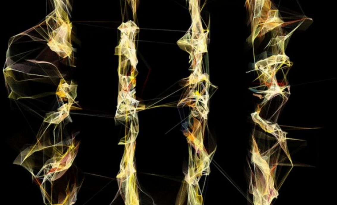
Biomimicry: generative art of @inconvergent
inconvergents plotter plotting a plot @inconvergent is a guy who makes magical, beautiful art with algorithms, heavily influenced by nature. In my endless ignorance, I did not think those two things could combine quite like that. I have of course seen wonderful things that nature do, like the amazing life of slime moulds, the murmuration ...
Doodling maths: Visualising prime numbers
Prime numbers are a cryptographer's dream: It's easy to take two very large prime numbers and multiply them, but it's extremely hard to do the opposite. There is no fast algorithm (yet) to factorize an integer into its prime factors, if you try to factor a large prime number you'll have to try every possible number between 2 ...
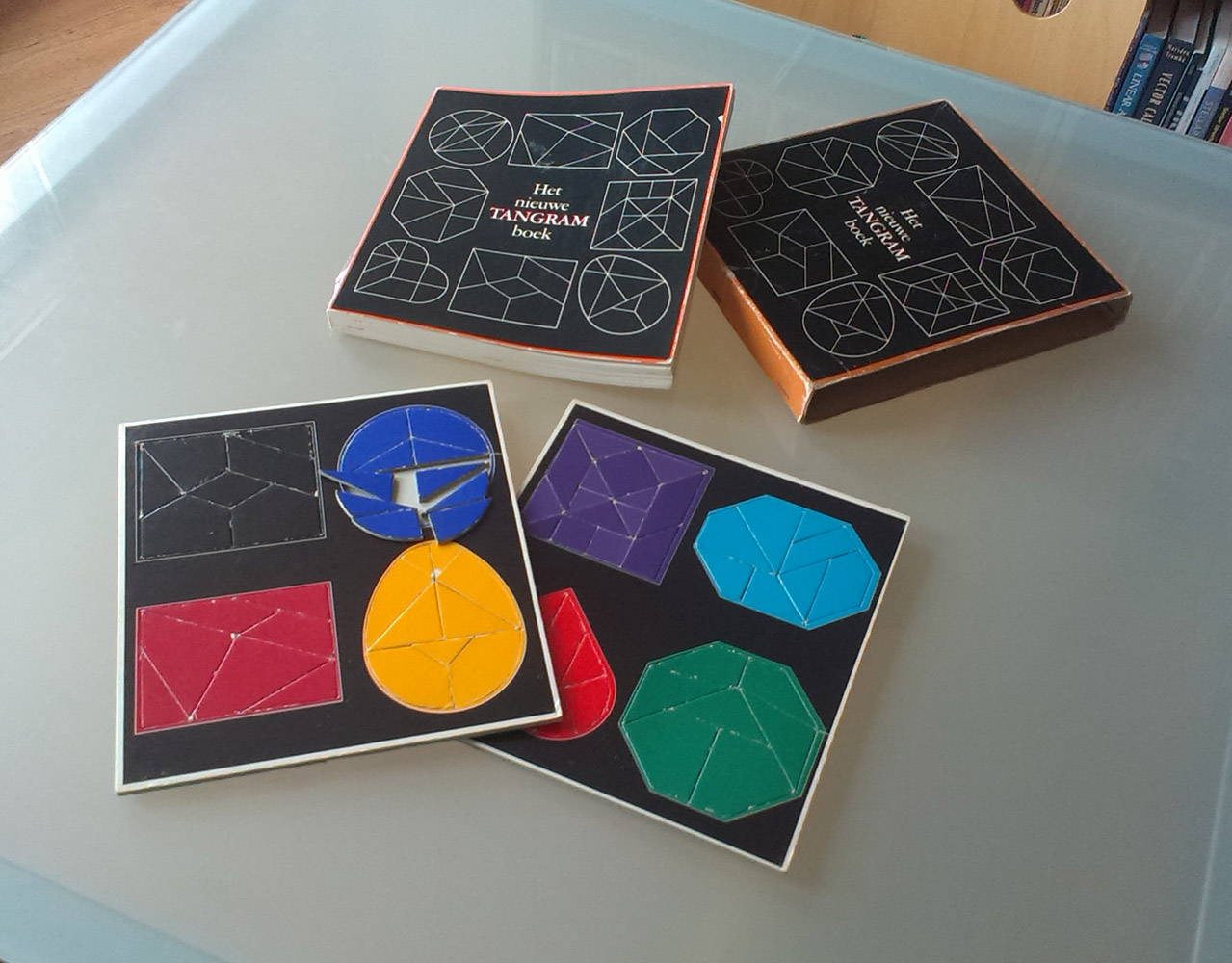
The New Tangram Book
Puzzles have always fascinated me. Language puzzles, escape rooms, logic problems. When I code, I tend to see the coding problem as a puzzle that I need to solve. Especially CSS feels like that lots of the time. Recently, I dove into my parent's bookcase and fished up this old jewel: This 70s book is ...

You know you want one: science nerd merit badges
Out of the generosity of the Order of the Science Scouts of Exemplary Repute and Above Average Physique I have been allowed to recreate their science nerd merit badges. You can find the indexed list here, or you can go directly to my Cafépress profile. No, this will not in any way make me rich and/or famous, ...

Charts: the horror of three dimensions
We have really cool tools to make information and data visible, I find joy in beautiful visualisation of complex information. I see, I learn. But here is what makes me furious: three-dimensional charts. Never, ever make diagrams and charts 3D. NEVER. Here is why: Graphs, diagrams and maps are tools to ask questions. Sometimes they are ...
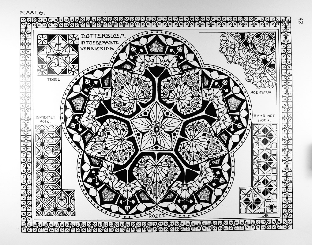
J.H. Boot: master of stylisation
I posted about stylisation before, and I'd like to show where I got my inspiration. So without further ado, some of the 'plates' from J.H. Boot's book on how to take some natural object and turn it into something of mathematically precise art. It still amazes me that Boot did not just take the time ...

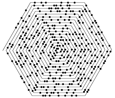
Twelve-fold symmetry
Little trick in Illustrator. One group of half-transparent objects, mirrored and rotated for a twelve-fold symmetry effect. Change one object, all eleven others follow suit. Goodness ensues ...

Images in the time of cholera
In 1854 there was a cholera epidemic in London. The accepted theory at the time was that illness and epidemics spread through the "miasma", a form of "bad air", pollution and smell emanating from decomposing organic matter. The mechanics of germs was not understood. Dr. John Snow was sceptical to the miasma theory, but not entirely grasping germ mechanics, ...
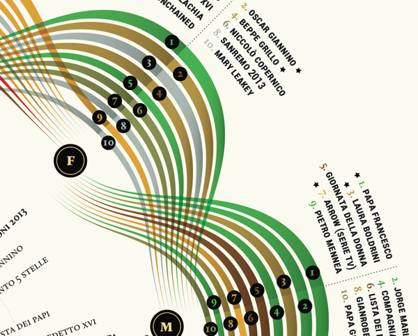
Visual Italian Wikipedia use
I do not read Italian, but I can certainly appreciate these wonderful multivariate visualisations. Valerio Pellegrini made this gorgeous visual representation of Italian Wikipedia use for 2013. Months are distributed clockwise with Italian initial for each month. It has three layers of information and data: the inner level; overall top edits, the second it is ...

The gorgeous polyhedra sculptures of George Hart
George Hart is a professor in engineering and a freelance mathematical sculptor, designer and artist. With the basis in mathematics, he creates stunning sculptures in a variety of materials and sizes, in principle, based on basic polyhedra. But his sculptures are anything but basic. The fact that this shape .... can turn into this, delights ...

Platos sacred geometry
Plato's sacred geometry: In Euclidean geometry there are five Platonic solids. Each of them was associated with an element, and since there are five, one of these shapes were considered sacred by the old Greeks, and to know the shape, and to share that knowledge was punishable. Platonic solids have clear definitions, to quote Wikipedia: ...
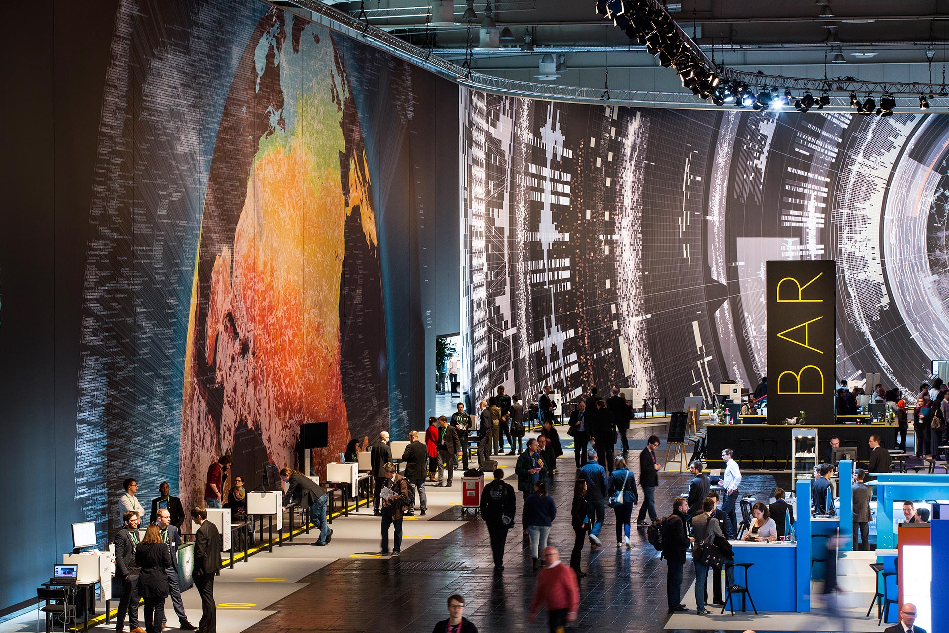
Massive scale, breathtaking data-driven visualisation at CeBit 2014
I sometimes come across data visualisations that takes my breath away. This is one. Created by the design house Kram/Weisshaar for the CeBit 2014 computer expo in Hannover. Wish I was there. It is of course the sheer size that makes an impact, but the visualisations themselves are amazing, the amount of data accessed mindblowing, ...
Piet Hein, danish design and the super-egg
Piet Hein was a modern danish renaissance man. He was born in 1905, died in 1996, studied mathematics, started art studies he never finished, started studies in theoretical physics and never finished that either. He wrote books, poetry ("gruks"); did illustration, designed objects and public spaces, researched mathematics and was a cosmopolitan. He is famous ...

Visualising data, telling stories
Telling stories that can only be seen. Data visualisations can be extraordinarily beautiful. Here are but a few tools. gephi Open-source desktop application, primarily a network visualisation tool, but with plugins galore for space-time extensions. Gapminder Beautiful, multivariate statistics. See this phenomenal TED presentation by Hans Rosling - love that guy Google charts Not surprising, ...

Beautiful statistics
Hans Rosling, the hero of beautiful statistics, showing us the world as it actually is. By making statistics beautiful and demonstrating that the impossible is possible. Oh, and btw; you can play with the Gapminder tool yourself ...
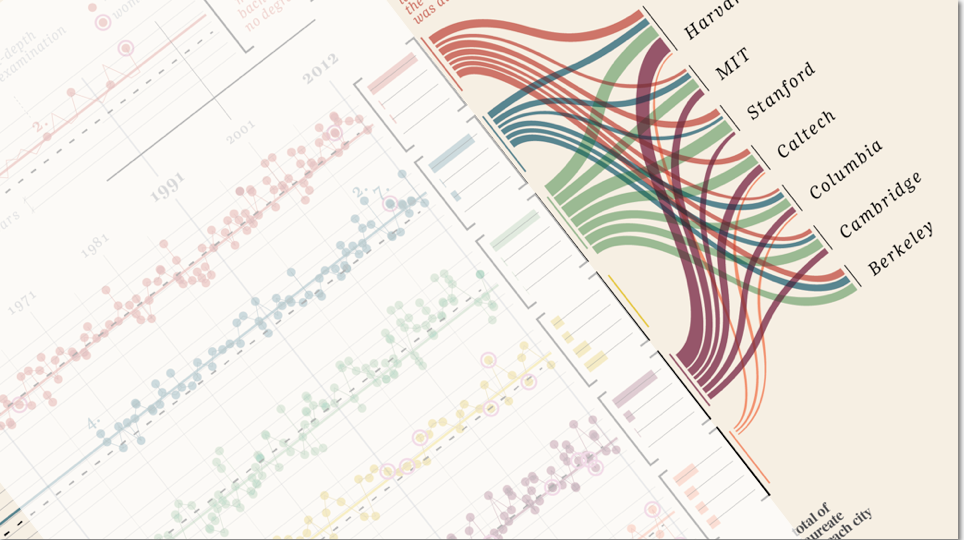
“Design is where science and art break even”
Once in a while I come across some images that takes my breath away, and make me intensely wish that I had thought about it myself. Art can of course do magic, but the combination of information and art, I feel, somehow takes both to a higher level. Giorgia Lupi Has made these amazing charts ...