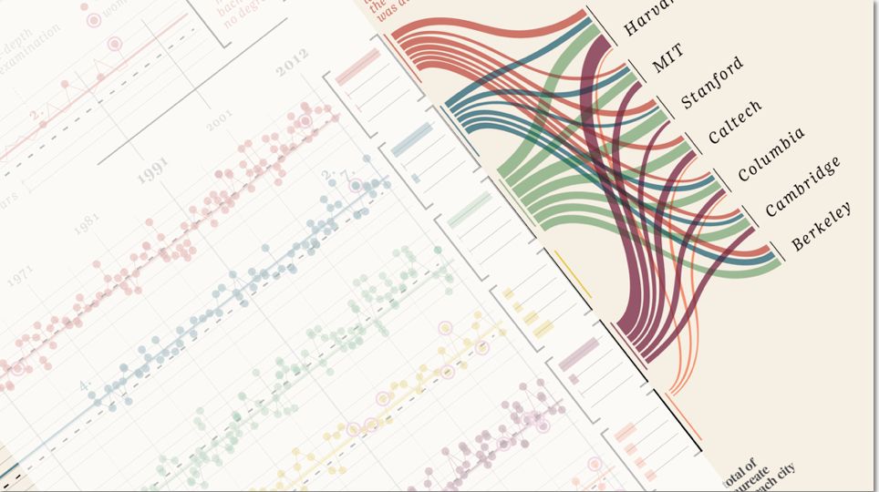
Once in a while I come across some images that takes my breath away, and make me intensely wish that I had thought about it myself. Art can of course do magic, but the combination of information and art, I feel, somehow takes both to a higher level. Giorgia Lupi Has made these amazing charts of Nobel laureates. The adventure in discovering the content is deeply satisfying.
The information density is incredible; the chart tells the stories of the laureates:
- in what field
- by age
- average change in age over time
- graduation grades
- sex
- university affiliation
- hometowns (country)
- if the prize was given to more than one person
… and seven point on noteworthy laureates. I doff my hat to you, Giorgia Lupi.
(Images used with permission)


One thought on ““Design is where science and art break even””