Category: Visualisation
Representing something in a visual way. New ways to see.

Inside my brain: lasers and gold
This was going to be a triumphant article about a stellar idea, a struggle of problem solving, learning curves, dangerous lasers, and the final, exuberant splendid result in all its plasticky-golden glory. Yeah, well… The idea! …so the idea: to laser engrave a bunch of slices of my brain in transparent acrylic, stack them… it ...

Navigation – paddling the web
When we make websites for clients we analyse their business, their products, and their customers. We create interfaces that are logical, that helps drill down. I am looking to buy a notebook. This company sells stationary. A top-level category then might be "paper products", "writing and drawing", "blank paper" or something like that. So I ...
iNaturalist: citizen science in your backyard
I was going to write an article about the Encyclopedia of Life. It is a phenomenal undertaking, its goal is to create one web page for every living species. Right now they have 1,322,989 pages. That is 1.3 million living things. It is a herculean effort, and it takes the biggest institutions and the best ...

Open Science: Map scaled by number of journals published there
Iara Vidal is working on her PhD in Information Science at the Federal University of Rio de Janeiro in Brazil. She is an expert in altmetrics (altmetrics are non-traditional metrics proposed as an alternative to more traditional citation impact metrics). This is what she has to say about access to information: I don’t think anyone would deny that ...

Abstracting the map
Tung studio in Toronto decided to reinvent the map. The results are beautiful abstract-ish quilts, showing neighbourhoods as ideas. you could not navigate by these obviously, but they are beautiful, understandably map-ish. My thought is that we do not need paper maps anymore, so we are free to reinvent them as ideas and abstract representation of ...
Doodling maths: Visualising prime numbers
Prime numbers are a cryptographer's dream: It's easy to take two very large prime numbers and multiply them, but it's extremely hard to do the opposite. There is no fast algorithm (yet) to factorize an integer into its prime factors, if you try to factor a large prime number you'll have to try every possible number between 2 ...

The network
The network. The most common question I get when people see my drawings are "how long did that take you?!" The next question is "what is it?" Neither question being relevant or interesting. It seems a piece of work is weighted and valued by time and meaning must be figurative. I find this very odd, this need for everything to ...

Games that do science
When the internet was fairly new, a project without precedent set itself to push the limits of what seemed then inconceivable for both science and technology. It was called SETI@Home, and it marked the beginning of a completely new era. SETI's goal was to detect intelligent life outside Earth. To do so, the project collected a ...

My geologic timeline in the magazine Science & Vie!
A long time ago I made a geologic timeline as a (vector) brush in Illustrator, with .ai and .eps files free for anyone to use. The only thing I ask is that if you use it, let me see the result. Making the timeline was incredibly time-consuming and ludicrously fiddly. So, a while ago I got ...
Kurt Vonnegut: the shape of stories
Been an avid reader of Kurt Vonnegut for a years. Magic, mad, brilliant. I found this visualisation by mayaeilam fascinating (though I would have liked to see the visuals more in the Vonnegutian tratdition of doodlyness, and not quite so sleek-ish). From now on, stories will not be the same... by mayaeilam ...

Dangerous tectonic visualisations
Dangerous tectonic visualisations: Visualisations are good things. They should be beautiful to look at, informative and invite discovery. But they can be very dangerous. Visualisations can be used to make decisions, learn something new, connect surprising dots, showing unknown connections. If you want to buy a car, you might find a visualisation that shows the ...

Visualizing DNA
When I was doing my Thesis (population genetics, migration), I spent a fair amount of time extracting DNA from blood samples. The process was fascinating, and a little demanding - precise pipette handling can leave your shoulders in misery! Anyhow, it took us two days to get 'pure' DNA from a blood sample, and day II was always my ...

Charts: the horror of three dimensions
We have really cool tools to make information and data visible, I find joy in beautiful visualisation of complex information. I see, I learn. But here is what makes me furious: three-dimensional charts. Never, ever make diagrams and charts 3D. NEVER. Here is why: Graphs, diagrams and maps are tools to ask questions. Sometimes they are ...
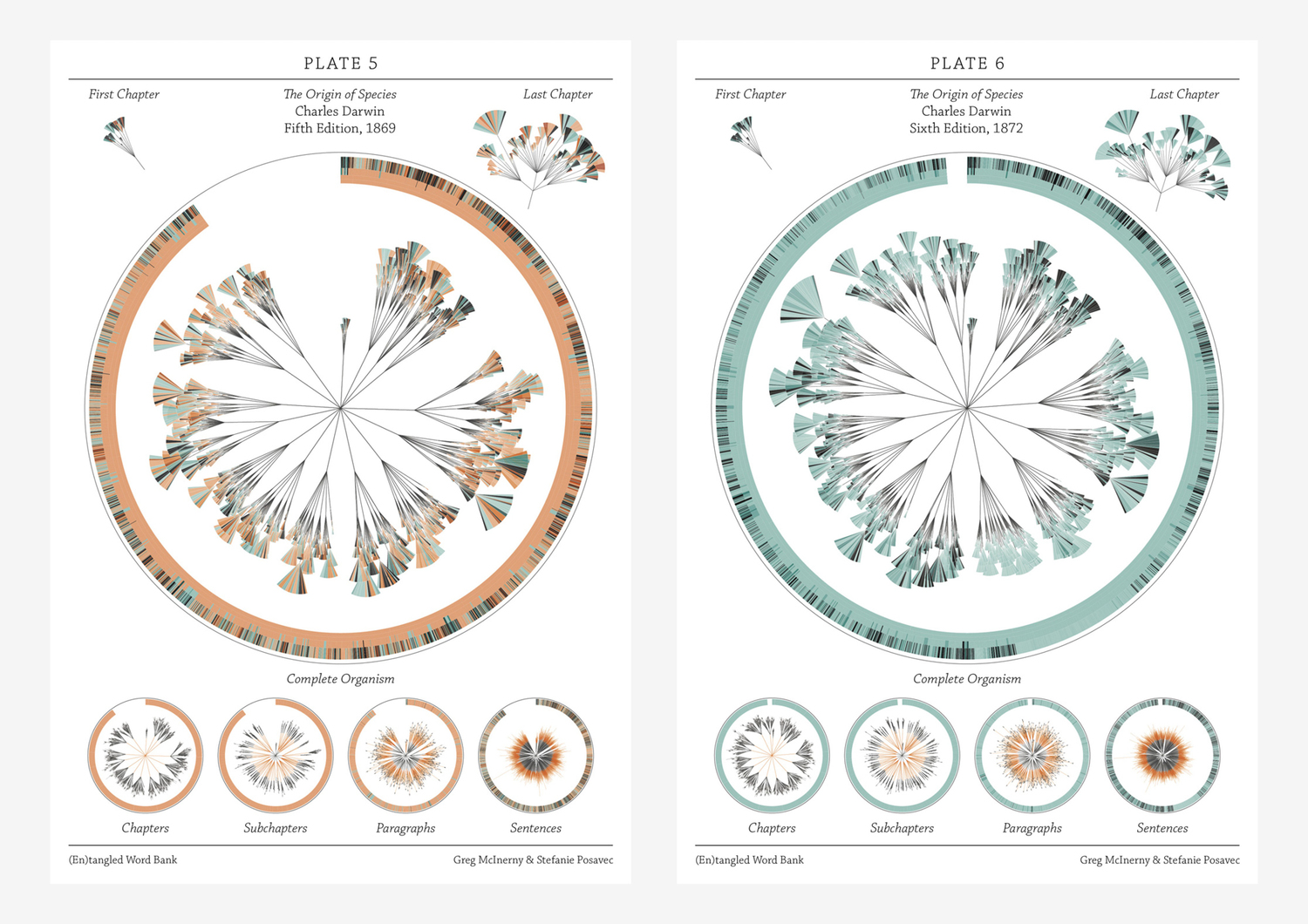
There is grandeur in this view of life – visualising Darwin
If I were to give an award for the single best idea anyone has ever had, I had to have to give it to Darwin, ahead of Newton and Einstein and everyone else. It is not just a wonderful scientific idea; it is a dangerous idea. it overthrows, or at least unsettles, some of the ...

Voynich manuscript – secret knowledge or brilliant hoax?
Since we are on a roll with old books and manuscripts, I give you the 240-page Voynich manuscript. It is an unsolved enigma: a manuscript found in Italy; the paper has been dated to between 1404-1438. It contains text in an unknown script, unknown language, and illustrations of non-existing plants, constellations and humans apparently doing ...
Scalable geologic timeline II
For the geo-geeks out there, I have finished my geologic timescale brush; now better and more accurate than the previous one. Download the Illustrator file here Download .EPS file here Included is a swatch folder with all the colours as per the instructions of the International Commission on Stratigraphy: You are welcome to use this in ...
W. B. Gould: artist and convict
William Buelow Gould (1801 – 1853) was an English artist convicted for stealing a coat and was sentenced to seven years of labour in Van Diemen's Land (Tasmania). He constantly got into trouble, also in the penal colonies, and was regularly punished for offences such as drunkenness, petty theft and forgery. His talent, however, got ...

WPA posters – art in the depression
During an extended period of the depression in USA (between 1935-1942), the US federal government supported artists by commissioning artwork for non-federal places and activities. Early on in the project, posters were painted by hand, each individually created. Later on, they were printed with silk screen. According to the US library of congress, "over two ...

Design and information
Confusion and clutter are the failure of design, not the attributes of information. – Edward Tufte ...

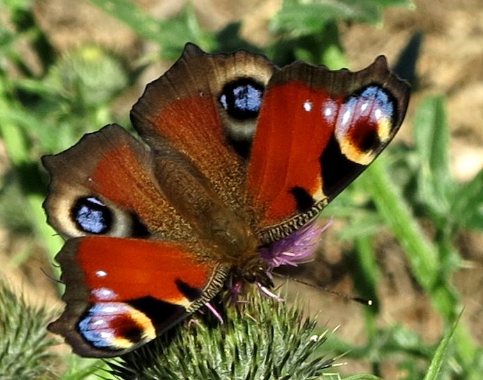
Living evolution: archaeopteryx, pterodactyl, hoatzin
pterodactyl Archaeopteryx Hoatzin bird I am going to skip over the arguments against the imbeciles who believe that the world is 6000 years old. Richard Dawkins are nobly taking that task upon himself. About 150 million years ago, the pterodactyl roamed the skies (pterodaktulos, meaning "winged finger"). There is something about that shape (and size!) ...

Fritz Kahn: the human as industrial palace
(I was horrified to discover that Wikipedia does not have an entry on Fritz Kahn in English. I was utterly unaware of how deep into obscurity this multitalented man had fallen. Update: my pigheaded ability to pester strangers have resulted in an solid entry on Kahn on Wikipedia. Many thanks to Yngvadottir ). man as ...
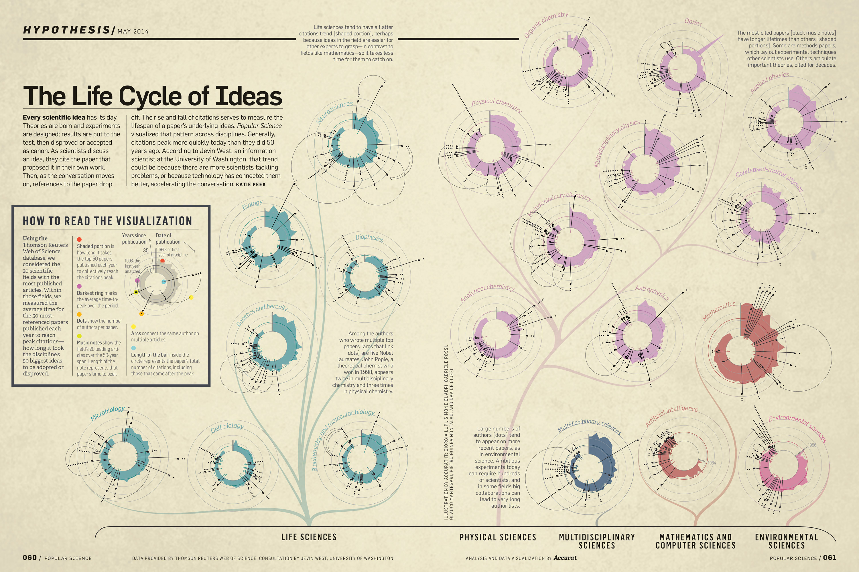
The Life Cycle of Ideas, Accurat for Popular Science
Giorgia Lupi once again comes up with stunning, informative and elegant data visualisation. This time, the life cycle of ideas. You can see another of hers in my post Design is where science and art breaks even ...

Creative mapping: paper towns, trap streets, cartographic treasure-hunts
Q. Why was longitude boiling mad? A. Because it was 360 degrees. Cartographers are/were often seen as pretty dour characters. Not so long ago, maps were hand-drawn, and hanging over a drawing table, the meticulous of drawing contours seems rather nerdy. But, as programmers put easter-eggs in code, cartographers do the same. Map makers sometimes ...

The world inside USA
Frank Jacobs blog about weird maps is a source of laughs and curiosity. It contains the real, the fictional, the fantastic and the self-made. He found a map of USA with each state named after a country with corresponding GDP, though I would have liked a colour-coded intensity added, it is well worth a study. (I ...
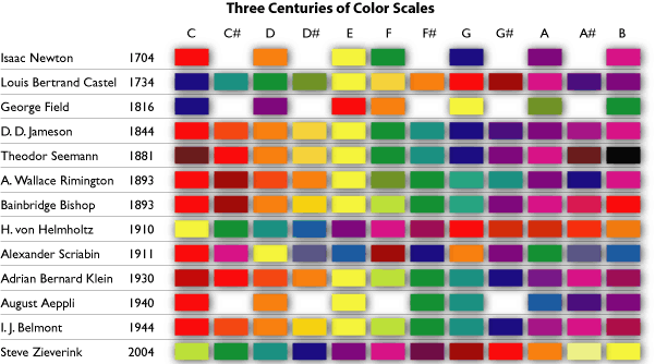
Synesthesia: hearing colour, seeing sound
Synesthesia is a neurological phenomenon where one sensory experience is automatically accompanied by another. The most common is colour synesthesia and chromesthesia. Colour synesthesia is where for example letters, numbers or weekdays gets a colour automatically "attached". Tuesdays might be purple, the number 9 red or things like that. It is automatic, involuntarily. People with colour synesthesia can remember phone numbers ...
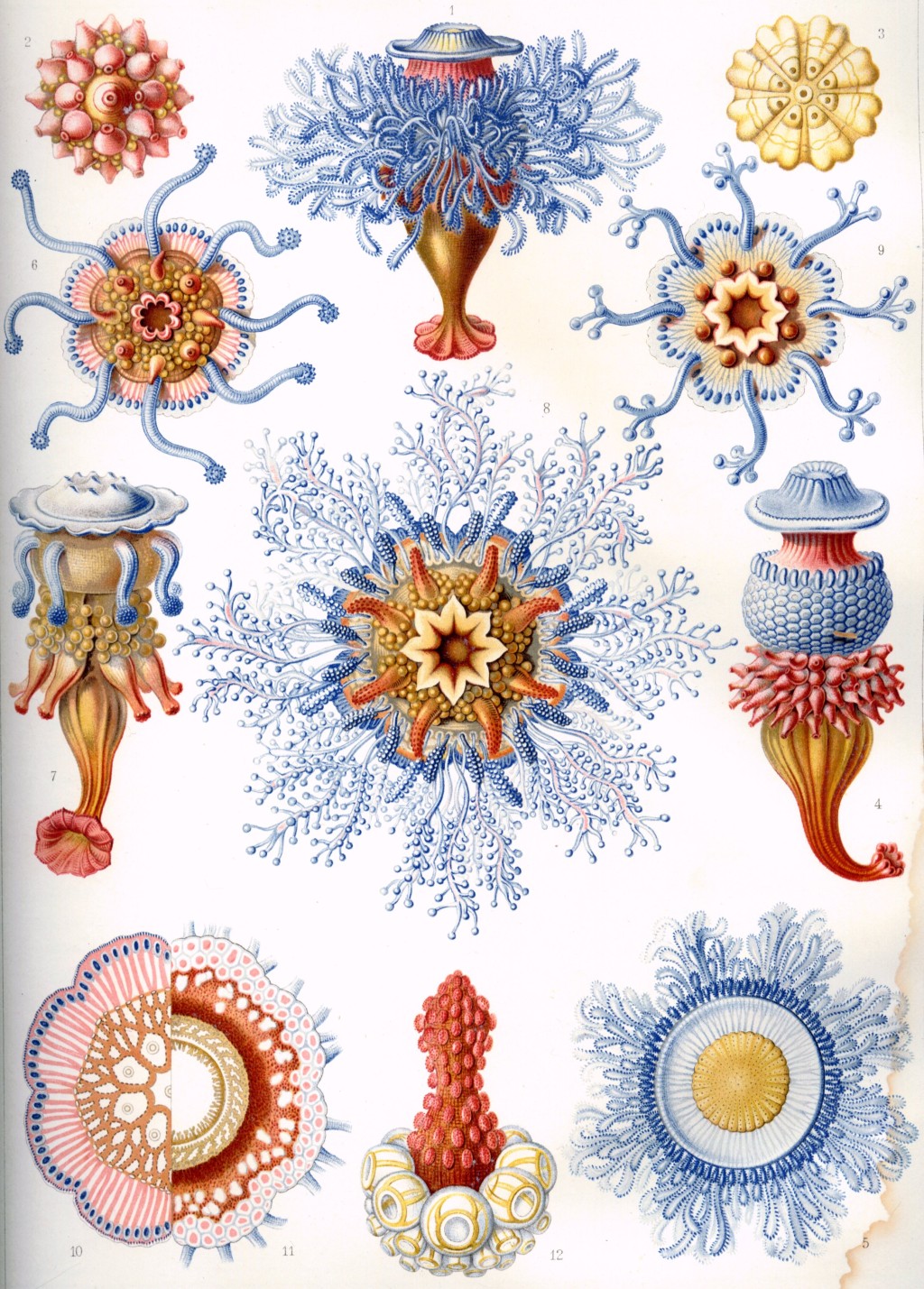
Ernst Haeckel: art and science through the microscope
Ernst Haeckel Ernst Haeckel (1834 – 1919) was what we call a renaissance man. He was a professor, biologist, philosopher, physician, naturalist and artist. His contribution to biology, evolutionary theory and art is still mind-boggling; we owe a great deal of biological understanding and terminology to him. He was a great promoter of Darwin's theory ...

Smarties and the shape of the earth
The sphere is, according to Wikipedia, a reasonably correct model for earth. But mathematically the earth is an oblate spheroid. An example of that would be smarties and M&Ms, spheres squished at the poles. As a result of gravitation and the rotation of earth, it is about 21 km longer than the Earth’s polar radius. This is, of course, ...

Images in the time of cholera
In 1854 there was a cholera epidemic in London. The accepted theory at the time was that illness and epidemics spread through the "miasma", a form of "bad air", pollution and smell emanating from decomposing organic matter. The mechanics of germs was not understood. Dr. John Snow was sceptical to the miasma theory, but not entirely grasping germ mechanics, ...

David Rumsey collection: mapping history I
David Rumsey's gigantic collection of historical and modern maps, schematics, timelines, data visualisations, diagrams, history, time, sciences, religion is a never-ending source of wonder and inspirations. It is a bit of a trap, as I can spend days wandering around in the magical world of visualisations of history, science, culture, religion. Looking at the older ...
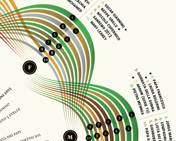
Visual Italian Wikipedia use
I do not read Italian, but I can certainly appreciate these wonderful multivariate visualisations. Valerio Pellegrini made this gorgeous visual representation of Italian Wikipedia use for 2013. Months are distributed clockwise with Italian initial for each month. It has three layers of information and data: the inner level; overall top edits, the second it is ...
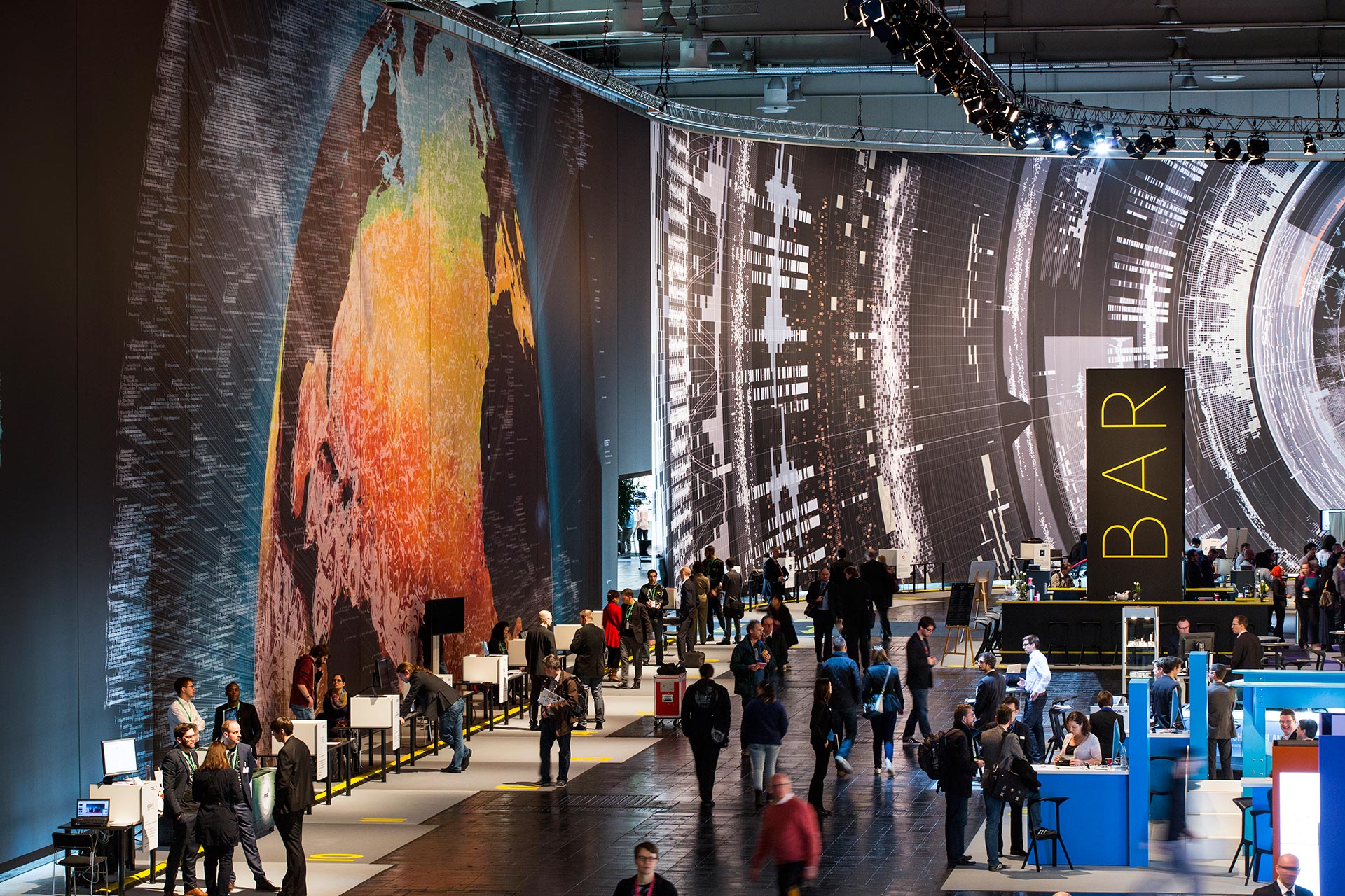
Massive scale, breathtaking data-driven visualisation at CeBit 2014
I sometimes come across data visualisations that takes my breath away. This is one. Created by the design house Kram/Weisshaar for the CeBit 2014 computer expo in Hannover. Wish I was there. It is of course the sheer size that makes an impact, but the visualisations themselves are amazing, the amount of data accessed mindblowing, ...

Visual science: the periodic table
Oxygen tries to play nice with the other elements in the playground ...

Visualising data, telling stories
Telling stories that can only be seen. Data visualisations can be extraordinarily beautiful. Here are but a few tools. gephi Open-source desktop application, primarily a network visualisation tool, but with plugins galore for space-time extensions. Gapminder Beautiful, multivariate statistics. See this phenomenal TED presentation by Hans Rosling - love that guy Google charts Not surprising, ...
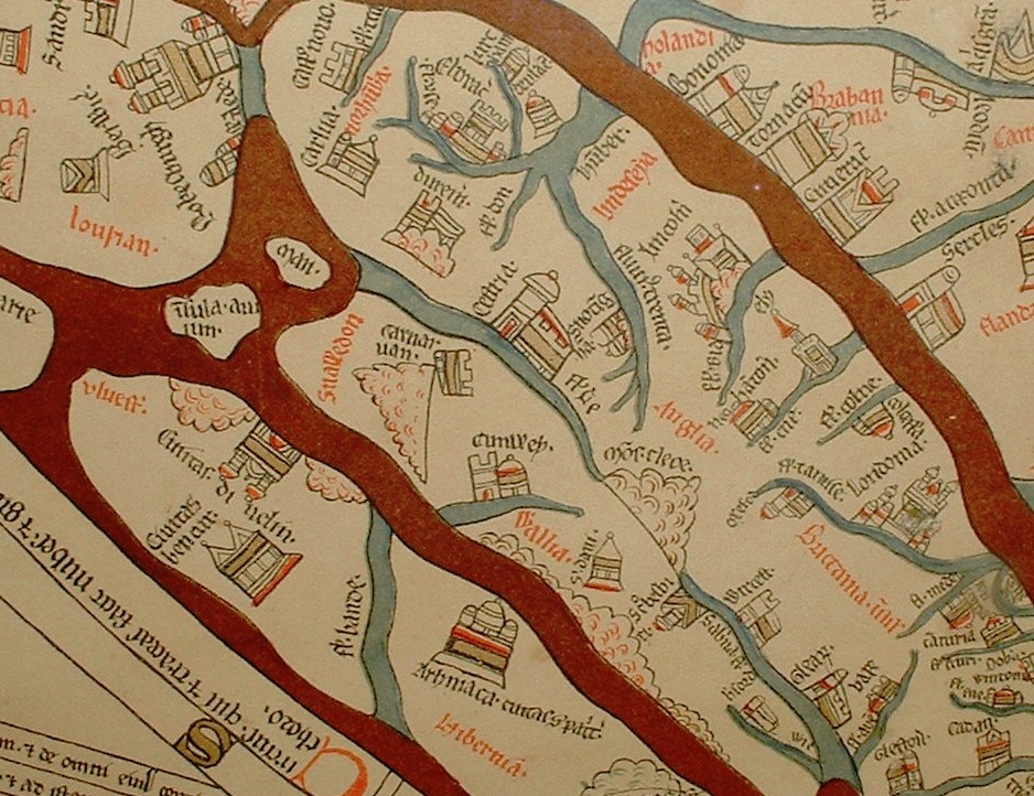
Maps: the time and space of the Hereford cloth of the world
Maps: the time and space of the Hereford cloth of the world The Hereford Mappa Mundi is one of the oldest know, complex map of the world (Mappa = cloth Mundi = world). It dates from about 1285, and are found in the Hereford cathedral. It depicts 420 towns, 15 Biblical events, 33 animals and ...

What is wrong with “interactive information”?
What is wrong with "interactive information"? Displaying information with heavy use of animation, interactions and happenings – why is it wrong? Why does video tutorials drive me batty? Looking for a tip in Illustrator, I find endless video tutorials and it annoys me no end. Why? Because all I want is an overview that I ...
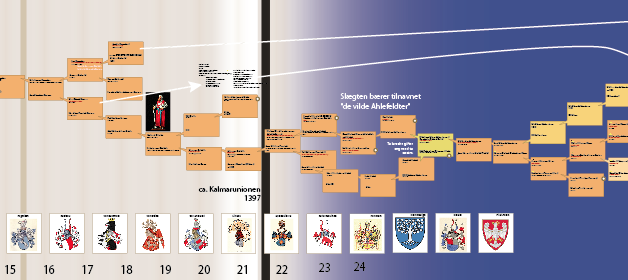
Multivariable visualisation: tracing 40 generations
A while ago, on a whim, i did some digging into my grandmothers family tree. I found more than I bargained for, as described in the post Noble genealogy. And I decided to make a family tree... A family tree of more then five generations soon gets complicated and it becomes impossible to keep track ...

“Next station! Pituitary Gland!”
Over at http://rangelmd.com/ there is this genius post: Human anatomy as subway map ...
Douglas Hofstadter: creativity
…qualities like quiveriness and vulnerability come to mind when I think of creativity… creativity requires a sense of smell, a palate to taste the scents that make brilliance. All life feeds upon the random. Creativity is the haute cuisine ...
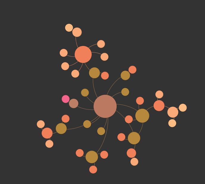
Life network
Take the things that are interesting, and see if you can connect the dots. This is made in Gephi, an open-source network visualisation tool. This will eventually be an interactive browser for my other blog ...
Beautiful statistics
Hans Rosling, the hero of beautiful statistics, showing us the world as it actually is. By making statistics beautiful and demonstrating that the impossible is possible. Oh, and btw; you can play with the Gapminder tool yourself ...