Dangerous tectonic visualisations: Visualisations are good things. They should be beautiful to look at, informative and invite discovery. But they can be very dangerous. Visualisations can be used to make decisions, learn something new, connect surprising dots, showing unknown connections. If you want to buy a car, you might find a visualisation that shows the reliability of several makes in a graph. Or price fluctuations. Pretty straightforward. Or not. Maybe.
I have sliced, diced, hung, drawn and quartered “interactive” visualisations before, with gusto and evil snicker.
But like the old fallacious idea that information that is printed on paper are to be taken seriously, visualisations often lies. Really lies. Approach visualisations of data with scepticism and a sharpened pencil.
I found, in a very serious book on visualisation theory, this map of tectonic drifts; i.e. earthquake zones. It is a scientific heat map that aims to identify the hotspot so to speak, and predict. Looks good, eh? It tells you what you probably already know, it reminds you of where the tectonic plates are. Lots of earthquakes in Iceland, Hawaii, New Zealand, west coast of the Americas, Middle East, Central Asia. All well. Looks legit. You scan it, confirm what you already (think you) know and move on. At the next dinner party, you might convey some of the stuff you saw here, use it to argue your point.

Here is what I find worrying. Slicing the map and attaching it without the standard layout, putting Asia in the centre. That suspiciously straight line in the ocean outside Japan -> Oceania: What does it mean? Data collections stop there? Is it estimated, calculated, guesstimated? If so, surely it is possible to make guesstimates and predictions on the other sub-sea tectonic boundaries? Is this map meant to predict future earthquakes, and if so, are we partially seeing potential sources of earthquakes, and/or impact/result of?

It seems to be the only place where there are data out in the ocean (apart from an odd little snippet between South America and Africa). Is that red field in the top corner of that square where we think earthquake starts, and that the coastline of Oceania experiences the result of this? But there is no tectonic fault lines in that area? And there is poor Hawaii…

I cannot work out what the black-versus-teal background is supposed to indicate. The map seems to show that there are few earthquakes in Africa and Siberia. But it should be no surprise: data basis for Africa (and Siberia) is often poor in global-comparison work. Note too, that the bottom maps simply skip Africa entirely. Skipping an entire continent. On what planet is that a good idea? If you do not have data, do not make it look like you have.
Now, to be fair, I am guessing all this is elaborated on in some accompanying text somewhere, but not any I can find. And I did find this in an academic book on visualisations. The authors of the book is running roughshod over a number of visualisations.
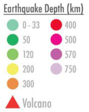 Another oddity is the colour coding between the two types of maps. There is a legend on the large map, giving classic red-yellow-green density. But some places there is purple. I assume this means “hotter than red”. The legend that seems to be only for the bottom four continental maps includes what we might call magenta, purple and lavender-ish; these indicate earthquake depth. I actually mixed them up. I think (and why does the bottom maps need to be quite so topographical?). I think I mixed them up. Not sure if they are relevant to both maps.
Maybe I am being wildly unfair. It could well be that the map is utterly solid, that it is what it is, that every single data point and calculation is dead on. But I have started to doubt, and that will only escalate, it will not go away.
Maybe I am asking this visualisation to answer too many questions, maybe I am demanding too much without enough intimate knowledge of the origin of this map. I lack the accompanying text. My knowledge of geology, tectonics, vulcanology is definitely limited. But there is the problem: visualisations are made to show and tell; we discover. We explore them. They are taken out of context (surely a scientific paper somewhere), put into books, websites, popular science publications. They are expected to speak for themselves. They do not. Likely, the creators might well be tearing their hair out over this. Visualisations start living their own lives.
Of course, we shall keep making visualisations. But to be true to data and scientific information we must show what we do not know. And as the world works today, if you cannot include that in the main image then incorporate text or another image that shows missing data.
Make it richer; teach us more.