Tag: complexity

A-maze
Listening to the QI No such thing as a fish podcast, I was alerted to the story of a Japanese girl, while clearing her caretaker-fathers stuff, found this amazing work. Apparently, he spent seven years doing this. I doff my hat. You can buy a print - more on this story here ...
Scalable geologic timeline II
For the geo-geeks out there, I have finished my geologic timescale brush; now better and more accurate than the previous one. Download the Illustrator file here Download .EPS file here Included is a swatch folder with all the colours as per the instructions of the International Commission on Stratigraphy: You are welcome to use this in ...

Design and information
Confusion and clutter are the failure of design, not the attributes of information. – Edward Tufte ...
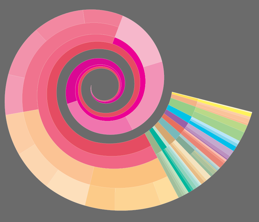
Visual Italian Wikipedia use
I do not read Italian, but I can certainly appreciate these wonderful multivariate visualisations. Valerio Pellegrini made this gorgeous visual representation of Italian Wikipedia use for 2013. Months are distributed clockwise with Italian initial for each month. It has three layers of information and data: the inner level; overall top edits, the second it is ...
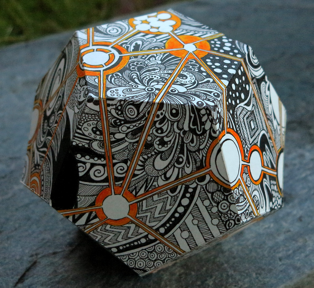
Paper and math: the 3D world
Math can be beautiful. The artist and professor George Heart Makes amazing sculptures, and he generously shares some of the templates so that the less talented of us can reproduce them. Here, I have made a model of his Frabjous in corrugated cardboard: frobjus I am a little partial to the dodocahedron, the 12-faced Platonic ...

The gorgeous polyhedra sculptures of George Hart
George Hart is a professor in engineering and a freelance mathematical sculptor, designer and artist. With the basis in mathematics, he creates stunning sculptures in a variety of materials and sizes, in principle, based on basic polyhedra. But his sculptures are anything but basic. The fact that this shape .... can turn into this, delights ...
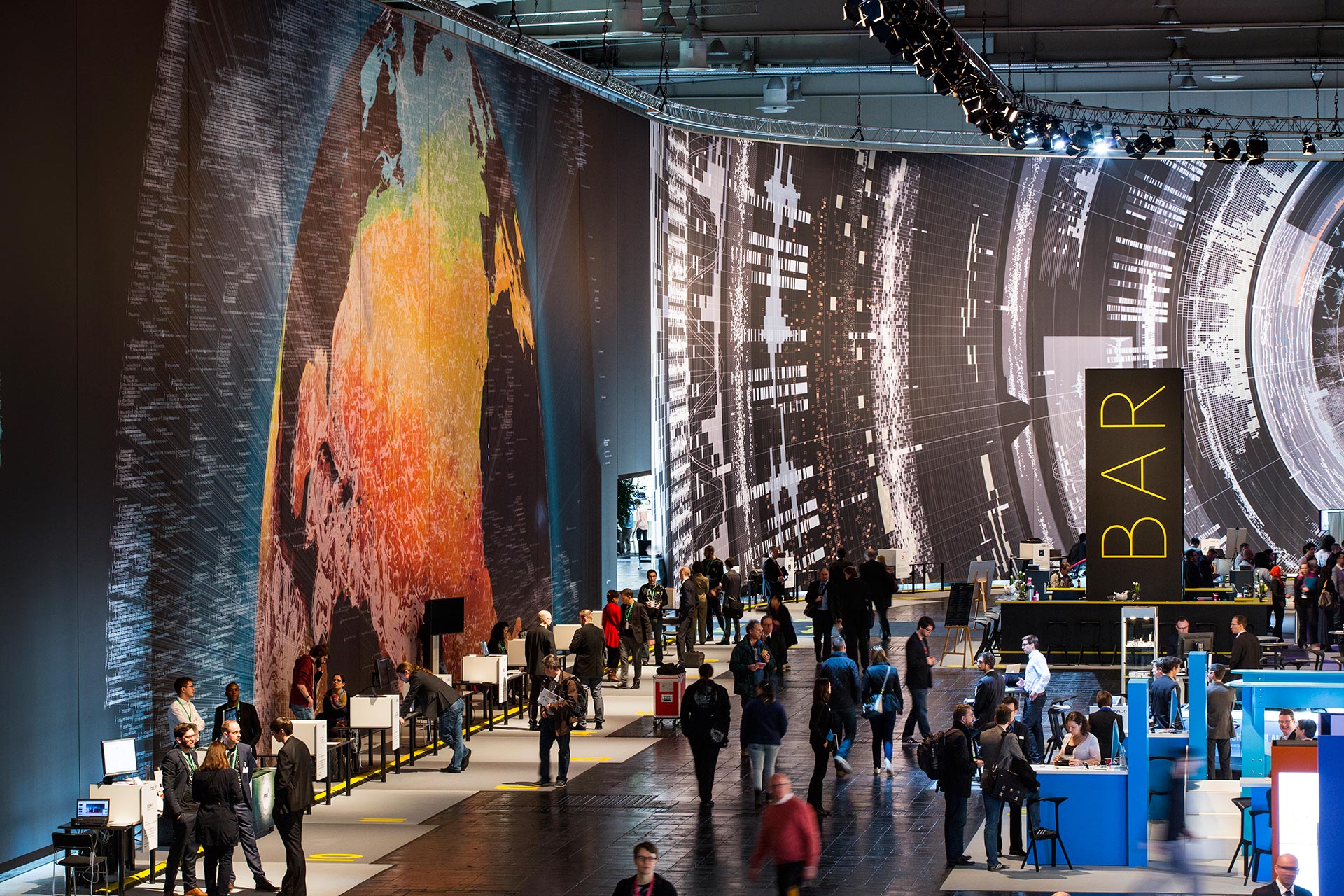
Massive scale, breathtaking data-driven visualisation at CeBit 2014
I sometimes come across data visualisations that takes my breath away. This is one. Created by the design house Kram/Weisshaar for the CeBit 2014 computer expo in Hannover. Wish I was there. It is of course the sheer size that makes an impact, but the visualisations themselves are amazing, the amount of data accessed mindblowing, ...
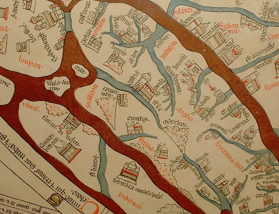
Maps: the time and space of the Hereford cloth of the world
Maps: the time and space of the Hereford cloth of the world The Hereford Mappa Mundi is one of the oldest know, complex map of the world (Mappa = cloth Mundi = world). It dates from about 1285, and are found in the Hereford cathedral. It depicts 420 towns, 15 Biblical events, 33 animals and ...

What is wrong with “interactive information”?
What is wrong with "interactive information"? Displaying information with heavy use of animation, interactions and happenings – why is it wrong? Why does video tutorials drive me batty? Looking for a tip in Illustrator, I find endless video tutorials and it annoys me no end. Why? Because all I want is an overview that I ...
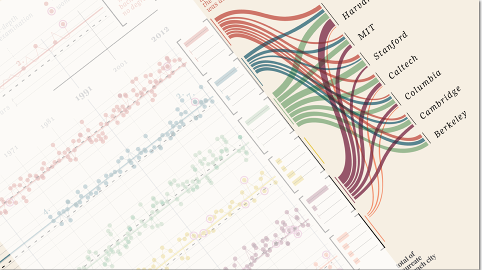
“Design is where science and art break even”
Once in a while I come across some images that takes my breath away, and make me intensely wish that I had thought about it myself. Art can of course do magic, but the combination of information and art, I feel, somehow takes both to a higher level. Giorgia Lupi Has made these amazing charts ...