What is wrong with “interactive information”? Displaying information with heavy use of animation, interactions and happenings – why is it wrong? Why does video tutorials drive me batty? Looking for a tip in Illustrator, I find endless video tutorials and it annoys me no end. Why?
Because all I want is an overview that I have found the right tut, a quick list with some screenshots details I can scan for confirmation, and a simple scroll-up-down if I mess up one of the steps. Going back and forth in video is a hassle. If I find a video tutorial on how to duplicate in degrees around a point, and I am out of there. The very least, I want a screenshot that shows me the end result. Why do I have to listen to some figure endlessly droning on about irrelevant stuff before I confirm that I am on the right track?
Video is very linear, obviously. Frame by frame. They also talk to the lowest common denominator, who seems to be a dimwit with an eccentric assembly of handicaps. I want to see the bits that I do wrong, and correct them. I want to spend as little time as possible on this. The odd arrow and circle will do nicely.
So what is wrong with animation and “interactiveness” in information graphics? There are some models that work (maps, obviously), but they are usually blindingly obvious and far between.
So. Case. No intention of offending anyone, but what is wrong with The Human Origins Program “Human Evolution Timeline Interactive“? This is, after all, from one of the largest information-handling complex of research and museums.
Before we get to the animated part…

First: time goes the wrong way.
No, really. I scratched my head a whole lot, looking for homo rudolfensis. Even when I corrected my left-to-right to right-to-left I could not find it. It is made in Flash, so I cannot use the browser search function.
The text is too small
 Even when I got the time direction right, I had trouble finding homo rudolfensis, because text overlaps. And again, I cannot search. Add 10 more species (as could well happen), and you have species-soup. As it is, it works for people who know exactly where to look and what they may find. But those people do not use toys like this; they are scientists.
Climate highlights disappear
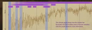
Bizarrely, information that is not actually in the way, disappears now and then. It seems the purple climate-bands vanishes when hovering over other things. But there is room for them there permanently, they are not obscuring anything. And it is a little unclear why they vanish. The information hidden in the purple bands also acts oddly – if you click on one, there is an overlay and a simultaneous animation in the background that pulls the purple band vertically down the page. But there is an overlay. You cannot really see it happening. Or having much meaning.

The information IN the box is fine though; though a little light on context for my taste. I cannot move the box, so if it – and the overlay – obscures something I would like to see simultaneously, that will not be possible. I will have to remember which purple band I clicked, go back to the timeline, and then click the next. And remember that information. Possibly in relations to species…this turns into Kim’s Game. The climate graph is good though, though I wonder if “climate graph” is strictly correct, as it is a temperature graph. No matter.
Milestones
 …are fine. Wonder though, if that ice-blue-purple colour confused me first time, as that would be a colour I would use for climate, ice-ages and such. The icons are good.
Species
 Then, click on a species, and you loose all connection to the “visual interactive” – your rudolfensis and the overlay obscures where you clicked, so you need to read when this creature lived instead of seeing it. You ask someone to go from one abstraction to another: visual representation in coloured bar length (compare possible), to a singular fact-sheet with numbers. All context is lost, all possibility of comparing. You cannot open more than one species fact-sheet at a time. Here we are back in the world of video and frame-by-frame.
If I wanted to look at two species and compare facts and images. Forget it. I cannot even copy the text so as to collect facts next to each other. And the image of Australopithecus sediba and the Australopithecus garhi are identical. But they are something like a million years apart. The text compares one to a third species. What does this mean? Is the image a “default extinct hominin” of the “we have no idea what it looked like, but had to stick a pic in there?” or is it a system fault? or what?
The only way I could write the names of those two species was to take a screenshot of each of the “fact sheets”, open them both, and spell the names as I wrote them. Most people do not write “Australopithecus” all that often.
The magnifier (the horror!)
 But.. I can use The magnifier. The magnifier obscures more and warps time. It is its own little timeline. To see what bit of the whole it shows is not possible. There is no scope. Back to clicking back and forth and comparing and guessing millions-of-years.
It has a colour-coded legend, but I am not allowed to see the legend AND interact with the coloured dots at the same time.
The magnifier makes an overlay over the main timeline, then the colour key makes a second overlay over the magnifier. If I cannot remember the code for nine arbitrary colours, I will have to click back and forth. I soon get tired of this.
The coloured dots placement is a mystery, and if a species lived for a long time, the species name is not visible. So you hover on coloured dots presumably connected to some species, and may or may not get that information.
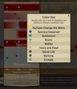
At this stage, I have forgotten why I clicked on the magnifier in the first place, as three levels of context are gone.
This is why I hate info-animation. It promises the world, and gives clunky frame-by-frame that does not even tell a story. I am better off reading all this off a simple list: then I would not have to switch between mental modes of image vs. number, I could compare, and I could SEARCH within and paste text.
Text in Flash is not indexable. The webdeveloper needs to bend over backwards to make the text in a flash-app turn up in search. But here is the thing: even IF your flash-text was searchable, I would end up on that interactive page, and I will have no idea where to find the origin of the text i searched for. Because it is hidden behind interactiveness. It is there somewhere. But I would have to click through every option to find it. And that is just not going to happen.
I want complex information presented in the one view, but here is the thing: this is not the same view. This is essentially frame-by-frame. We are back to the linear video, where going back and forth is a hassle and you have to remember a lot of information to be able to use it. So this, is for the most, part a linear interface masquerading as a complex, helpful interaction.
I do not mean to say that the developers of this timeline are incompetent imbeciles, this is pretty standard stuff. These things are everywhere. This IS complex and uncertain information. But either make it simpler or make it more complex.
Just because something can bounce or fade does not make it good information handling or helpful data visualisations.
One thought on “What is wrong with “interactive information”?”