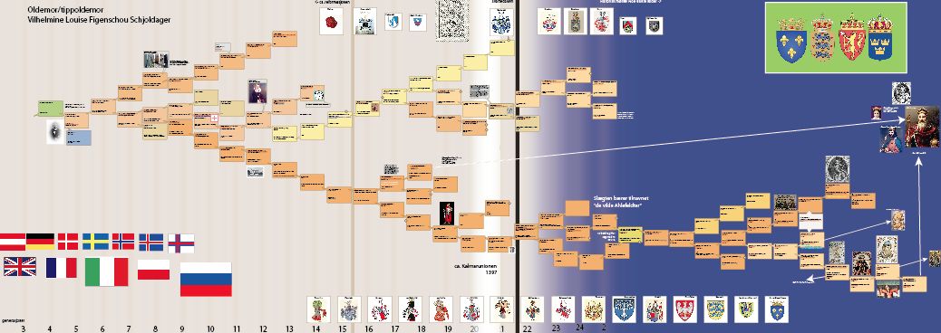
A while ago, on a whim, i did some digging into my grandmothers family tree. I found more than I bargained for, as described in the post Noble genealogy. And I decided to make a family tree…
A family tree of more then five generations soon gets complicated and it becomes impossible to keep track. I have to see it. Tentatively, I started with a classic idea of the fan-map family tree. It turns out, it is not really suited for more then about nine generations. Why? Because it gets enormous, and because of redundancy. With lines I could not follow (data lacking), I would end up with a lot of empty spaces in random places. Space wasted and difficult to utilise for the more information-dense parts of the family. I fiddled with spreadsheets, another classic genealogy thing to do. The Grid. Again, it was not really happening. I was trying to keep in mind to make something usable, I wanted to be able to manipulate the data later, export, rearrange, visualise. That quickly went out the window too, as I realised this was to be an exercise in multivariable data and information handling. So it becomes a prototype, a toy, an experiment.
Why, I hear you say, stress with all this? There are brilliant and cheap software out there that will do it for you!
Being a particular kind of (anal) person, I do not like them. They leave me little control and flexibility. So I had to figure what it was that I wanted from the chart. I wanted to see:
- names
- birth-death (ie age)
- occupations
- family crests
- locations (local, national)
- timespan
- some historical context
- interesting tidbits (my motivation for the whole thing was the “small stories”)
- images/portraits
- generations across lines
I played with the idea of movement/migration, extended families, siblings, but abandoned these for the most part, as my research unexpectedly unearthed rather long lines.
In short, I wanted stories. I wanted approximates in some aspects, and exactness in others. Details here, generalisations there. Being approximately right, instead of exactly wrong.
The chart would have to accommodate lines that stopped, and use that space for longer lines. This of course means economising space, and thereby throw out the grid. Good riddance, never been a fan.
The randomness of all these wishes sends spreadsheets packing. To structure the random and order in a retrievable, remashable way would take more time than I could be bothered spending on this little experiment (I am sure some genealogists will have a fit if they saw this).
Individuals
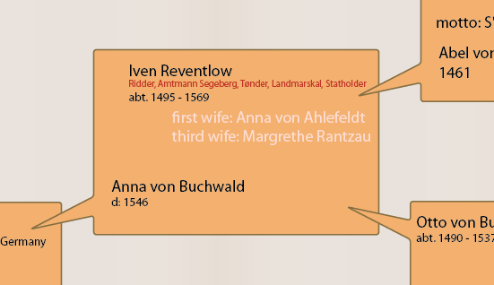 Each couple got a bubble with birth and death date and year. The bubble gives room for added info such as occupation (red), additional spouses or odds and ends I found interesting such as motto, interesting things they did, or as in one case, the one that “in a fit of anger did away with himself with a rope”. Tidbits. The bubbles from one couple points to their child etc. This gave me a little flexibility to shuffle things around, when lines disappear. There can be much uncertain in genealogy, and I needed space for the odd and interesting.
Historical time and generations
 Generations roughly corresponds vertically, indicated by gradients and a number down on the bottom. These numbers fades as historical darkness descends (dark blue fade): I do not have a lot of faith in genealogy from before the black death. The black death is indicated with the black vertical line, and the paler brown line some generations later approximates the reformation.
Place
 Locations are indicated by person, in the bubbles, if this information was available. On a national level, flags along the lower part indicates countries. I did consider scaling the flags to represent weight (“125 ancestors from Denmark”) or connect the flags to lines or individuals, but honestly could not be bothered. In this experiment, I liked the collected generalisation of the flags. To find out exactly who was from where or lived where, it can be found in the bubbles. Another problem would be that the flags of today was not the countries these people lived in, some countries do not exist anymore, and people moved across borders that was then, and no longer are now. So what flags to pick? To my mind, the flags represent geography, they are a generalisation.
Family names and crests
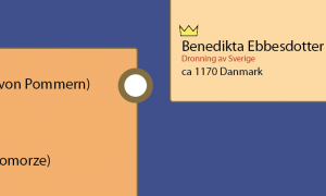 As with the flags, I thought of connecting the crests to the names, but it becomes a spaghetti. And in a way, it is not really that interesting. The sheer amount of crests are more interesting as a general idea, than the specific connections. They are however, easily worked out, and I added a dot on every time a “new” line of family name with a crest popped up. I.e., the first instance of a line with a crest has a little “railway station-dot”.
Tidbits and images
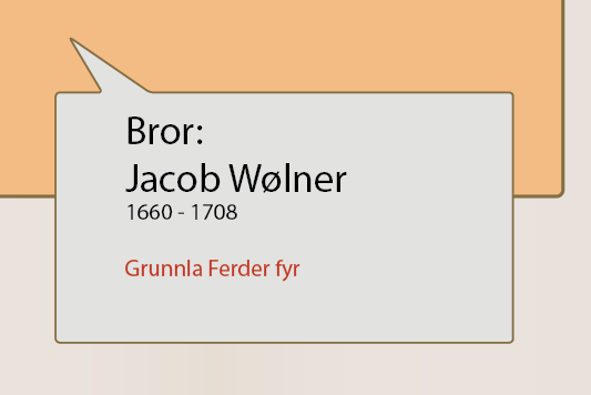 This is the tricky bit that threw the whole thing off a data-sustainable thing, and into the realm of chaos, design choices and confusion. I wanted room for bits and pieces. They are for the most part linked by grey bubbles. Images are – currently – placed in the vicinity of relevant people.
Unfinished lines
 The lines I have not followed entirely, simply becomes an arrow back in time to whatever ancestor I find at the very end of the line (or the point where I could not be bothered to go further). Some lines cross and recross, and that would maybe become a problem if I followed all the line through. The people married their relatives, and spaghetti ensues. It looks awful, but at this point I was pretty sick of the whole thing.
About colours
The choice of colours are rather random. I do however tend to use soft earthy colours for things I work on for a long time, simply because most primary and secondary colours hurts my eyes. The colours of the lines (successive bubbles) are pretty random and have no meaning as such, other than keep them visually separate. There would be no point in giving each line a colour, as they sometimes cross and recross. And what sex would you follow? I see no point in giving a male or female line more or less weight. The idea was to only colour-separate from lines, so that great-grandmothers (on mothers side) would be earthy-sandy, great-grandfather (on mothers side) in blues, and fathers grandparents two others.
Uncertainties, data
Genealogy is not a precise science. If science at all. People had children here and there, acknowledged some or all or none of them, had several spouses, lovers, adoptive children, foster children. Some lines have the same two names maybe alternating per generation: Hans Iversen, Iver Hansen, Hans Iversen, Iver Hansen, Hans Hansen and so on. This means more data is needed for verification (year of birth, at least). Still, there will be guesswork and opinions.
So…
This is an experiment, and if I will continue to develop it, I do not know. The idea is there anyway, to represent multiple variables, and custom fit to content. The chart is obviously not finished or refined to a desirable quality, but it is an experiment and a discovery of my family history. I made it as I went along, digging up ancestors, so there was no estimated scope from the beginning. It just grew. And grew. And grew. Now, I suspect, it is at a limit in size, and if I am to continue with the three other lines, I might have to reconsider and restructure.
Because this grew as I found information, I had not the faintest idea of what I might find, and there was no assessment of large-data solutions.
And bear in mind, this is ONLY my great-grandmothers´ family. So in theory, there are three more to go. And from preliminary snooping, maternal great-grandfathers line will go back to about year 100 Anno Domini.
What I would like to see in a potential future version, is
- more historical context
- more person-to-history-link (one guy was elected regent during a two-year interregnum)
- some better detailing on geography
This serves as an experiment in multivariable representations. Where some data shows details, and some show generalisations. It is not stylish, elegant or nifty, but it is one of those cases where “you have to walk the road” to get into the matter of multivariable data and information.
The whole thing can be seen here, in a rather monstrous pdf.
