We have really cool tools to make information and data visible, I find joy in beautiful visualisation of complex information. I see, I learn. But here is what makes me furious: three-dimensional charts. Never, ever make diagrams and charts 3D. NEVER. Here is why:
Graphs, diagrams and maps are tools to ask questions. Sometimes they are used to make strategic, academic and personal choices.
When did sales drop? When did child mortality increase? Did a war influence this? When did product A beat product B in income? Where do people vote for candidate X? Is there a correlation between company revenue and expansion? …and on and on.
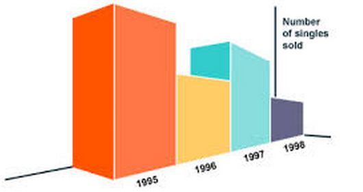
Bar chart
This is pretty clear why this one is not a good idea. The distortion is not massive, but it is there. It makes 1998 look measly; more measly than needed. A chart is supposed to – and in its very nature – give us some sort of fixed point from which to navigate.
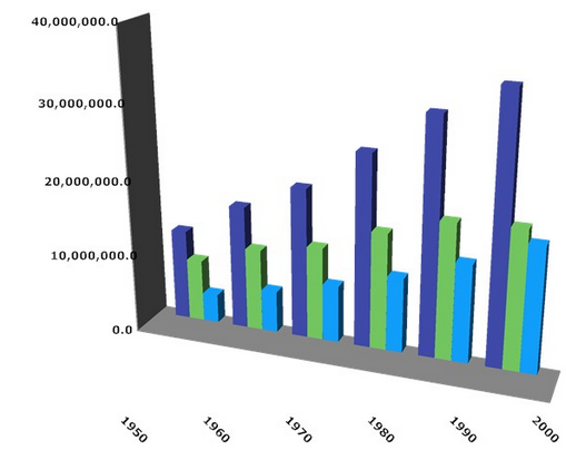
Here, someone has attempted to rectify the problem above by at least adding a scale on the axis. It is still impossible to really read; to get to grips with the core data. And what is that thing with the placement of years?! Someone should be knocked over the head with a brick.
Line chart
And what on earth is going on here?! What is wrong with clear, simple lines? The “box” itself, with the delightful mint-greenish colour has, the opposite perspective from the product “bands”. I can only assume that someone tried to make a see-through box with graphs inside. To read this thing, you have to find the markers on the “bands”: The pink has squares, the blue has diamonds and the orange has triangles. That is the data-points! It is interesting to see what goes on when two bands intersect. The points where they do would be interesting places; to find the figure in $. I challenge you to find the exact number of dollars in those places, and I challenge you to be absolutely certain of your finding. Highly offensive; an insult to data.

This is delightful in a horrid sort of way. It is “interactive” and therefore gets the sheen of “important”, “correct”. What a load of bollocks. It is pretty much impossible to get any sort of overview. Correlation, comparison impossible. You could be fooled to think that this thing contains more information than a straightforward line-graph, and technically it has x, y, z. It renders me speechless, really, I do not know where to start. You can get details by hovering, but you cannot get a general view. Interestingly, the “extra” axis contains information that is also supplied in the legend. Find the band that represents “Processor queue length” without using the colour coding.
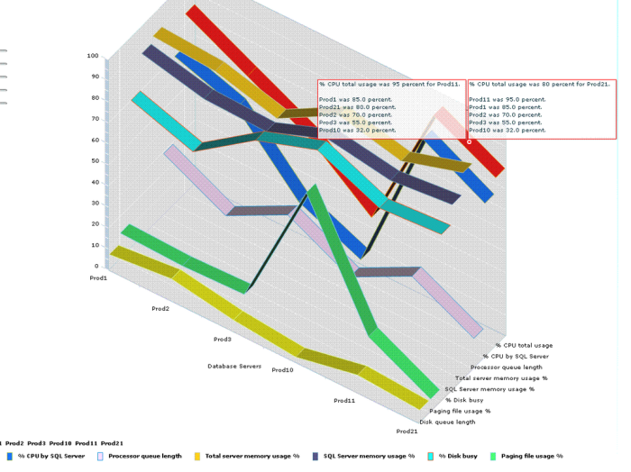
I really do not know what to say. This is a horrid concoction of colours, masquerading as information and data.
Pie chart
And then there is the all-time favourite, the pie chart. 3D piecharts should be hit in the face repeatedly. 3D exploded piecharts should be shot. Centred exploded piecharts should be hung, drawn and quartered. I bet you have seen stuff like this:

Right. I recreated it using the percentages. Compare them:

Then I 3D-ed it:

I exploded it as per the original, with the slices meeting in the centre. The spaces between the slices are not uniform…:

Then reverse the 3D, and we are left with this. See the problem…
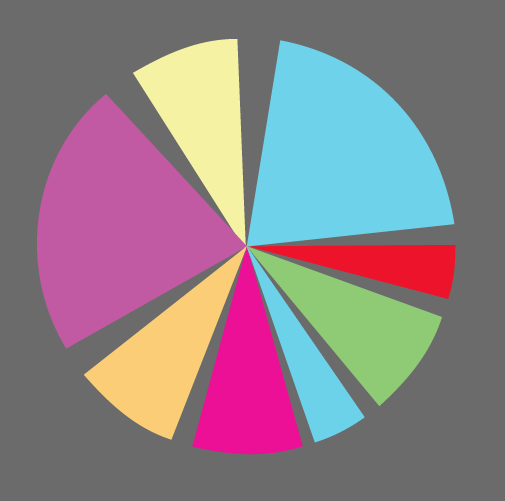
Reattaching the slices it turns out we have lost something like 20% of the piechart. Nice job.

This is why you should never use 3D in charts. If you do, after having read this, I will come to your house and poo in your mailbox.
