Tag: information visualisation

Open Science: Map scaled by number of journals published there
Iara Vidal is working on her PhD in Information Science at the Federal University of Rio de Janeiro in Brazil. She is an expert in altmetrics (altmetrics are non-traditional metrics proposed as an alternative to more traditional citation impact metrics). This is what she has to say about access to information: I don’t think anyone would deny that ...

Charts: the horror of three dimensions
We have really cool tools to make information and data visible, I find joy in beautiful visualisation of complex information. I see, I learn. But here is what makes me furious: three-dimensional charts. Never, ever make diagrams and charts 3D. NEVER. Here is why: Graphs, diagrams and maps are tools to ask questions. Sometimes they are ...
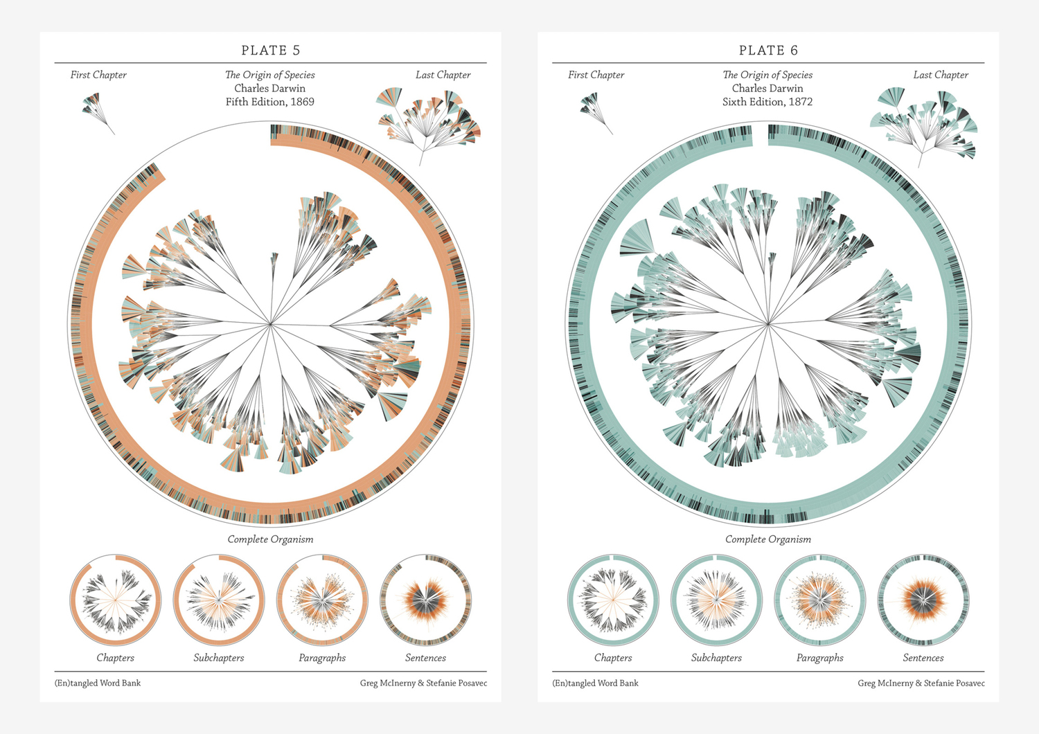
There is grandeur in this view of life – visualising Darwin
If I were to give an award for the single best idea anyone has ever had, I had to have to give it to Darwin, ahead of Newton and Einstein and everyone else. It is not just a wonderful scientific idea; it is a dangerous idea. it overthrows, or at least unsettles, some of the ...
Scalable geologic timeline II
For the geo-geeks out there, I have finished my geologic timescale brush; now better and more accurate than the previous one. Download the Illustrator file here Download .EPS file here Included is a swatch folder with all the colours as per the instructions of the International Commission on Stratigraphy: You are welcome to use this in ...

WPA posters – art in the depression
During an extended period of the depression in USA (between 1935-1942), the US federal government supported artists by commissioning artwork for non-federal places and activities. Early on in the project, posters were painted by hand, each individually created. Later on, they were printed with silk screen. According to the US library of congress, "over two ...

Design and information
Confusion and clutter are the failure of design, not the attributes of information. – Edward Tufte ...

Creative mapping: paper towns, trap streets, cartographic treasure-hunts
Q. Why was longitude boiling mad? A. Because it was 360 degrees. Cartographers are/were often seen as pretty dour characters. Not so long ago, maps were hand-drawn, and hanging over a drawing table, the meticulous of drawing contours seems rather nerdy. But, as programmers put easter-eggs in code, cartographers do the same. Map makers sometimes ...
3D printing: liver and silver
I am guessing we have all heard of the exciting new technology and research were it is possible to print organs. To me this is mind-blowing on so many levels: ponder the implications. We could print entire organ systems, repair damage, replace tissue, digitally mould external and internal organs. Just thinking about what this could ...
Visual Italian Wikipedia use
I do not read Italian, but I can certainly appreciate these wonderful multivariate visualisations. Valerio Pellegrini made this gorgeous visual representation of Italian Wikipedia use for 2013. Months are distributed clockwise with Italian initial for each month. It has three layers of information and data: the inner level; overall top edits, the second it is ...

Visualising data, telling stories
Telling stories that can only be seen. Data visualisations can be extraordinarily beautiful. Here are but a few tools. gephi Open-source desktop application, primarily a network visualisation tool, but with plugins galore for space-time extensions. Gapminder Beautiful, multivariate statistics. See this phenomenal TED presentation by Hans Rosling - love that guy Google charts Not surprising, ...

What is wrong with “interactive information”?
What is wrong with "interactive information"? Displaying information with heavy use of animation, interactions and happenings – why is it wrong? Why does video tutorials drive me batty? Looking for a tip in Illustrator, I find endless video tutorials and it annoys me no end. Why? Because all I want is an overview that I ...