Tag: diagrams

Dangerous tectonic visualisations
Dangerous tectonic visualisations: Visualisations are good things. They should be beautiful to look at, informative and invite discovery. But they can be very dangerous. Visualisations can be used to make decisions, learn something new, connect surprising dots, showing unknown connections. If you want to buy a car, you might find a visualisation that shows the ...

Charts: the horror of three dimensions
We have really cool tools to make information and data visible, I find joy in beautiful visualisation of complex information. I see, I learn. But here is what makes me furious: three-dimensional charts. Never, ever make diagrams and charts 3D. NEVER. Here is why: Graphs, diagrams and maps are tools to ask questions. Sometimes they are ...

The world inside USA
Frank Jacobs blog about weird maps is a source of laughs and curiosity. It contains the real, the fictional, the fantastic and the self-made. He found a map of USA with each state named after a country with corresponding GDP, though I would have liked a colour-coded intensity added, it is well worth a study. (I ...

David Rumsey collection: mapping history I
David Rumsey's gigantic collection of historical and modern maps, schematics, timelines, data visualisations, diagrams, history, time, sciences, religion is a never-ending source of wonder and inspirations. It is a bit of a trap, as I can spend days wandering around in the magical world of visualisations of history, science, culture, religion. Looking at the older ...
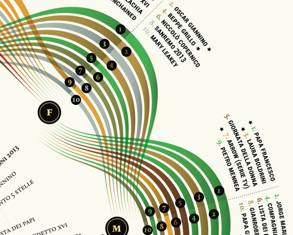
Visual Italian Wikipedia use
I do not read Italian, but I can certainly appreciate these wonderful multivariate visualisations. Valerio Pellegrini made this gorgeous visual representation of Italian Wikipedia use for 2013. Months are distributed clockwise with Italian initial for each month. It has three layers of information and data: the inner level; overall top edits, the second it is ...
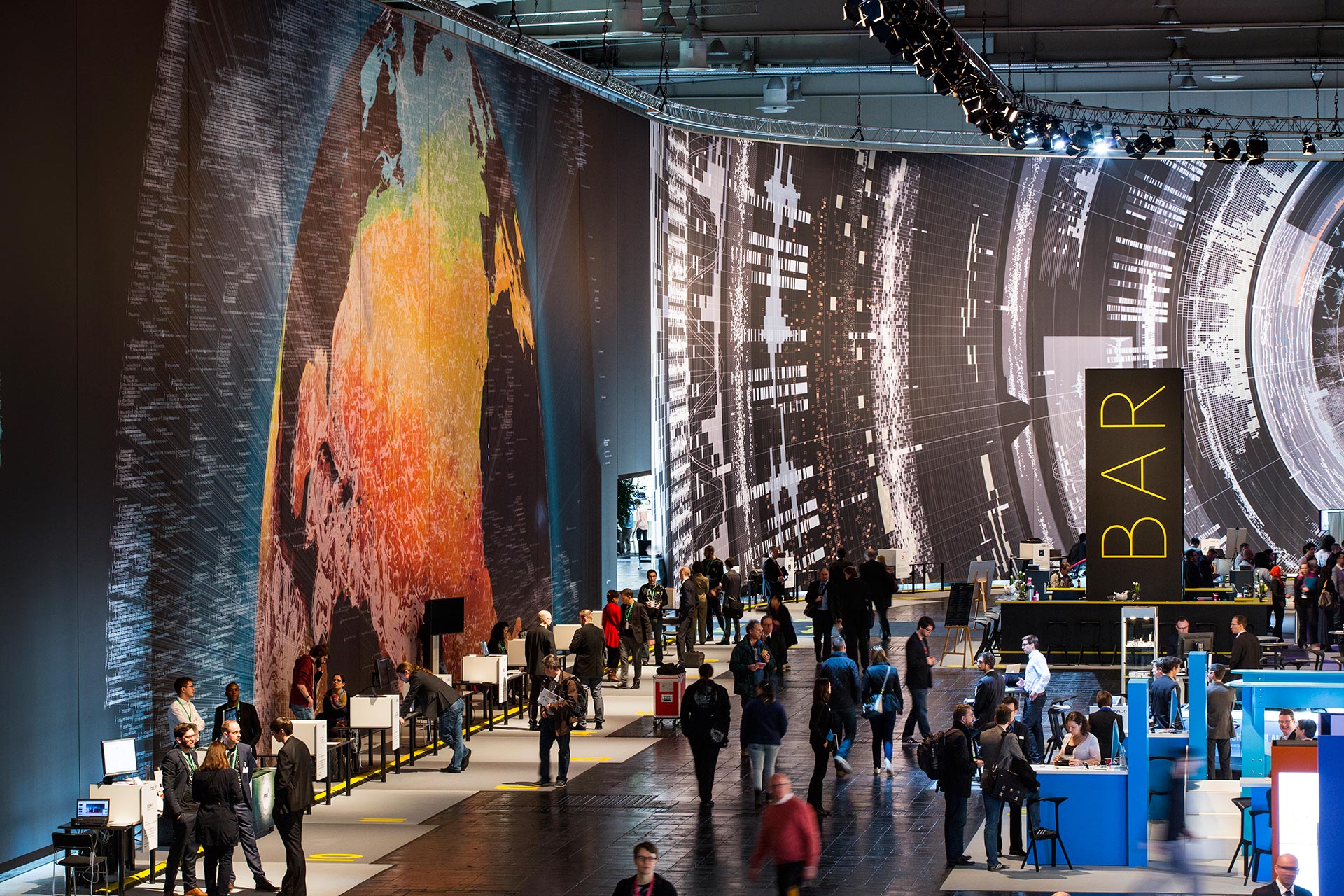
Massive scale, breathtaking data-driven visualisation at CeBit 2014
I sometimes come across data visualisations that takes my breath away. This is one. Created by the design house Kram/Weisshaar for the CeBit 2014 computer expo in Hannover. Wish I was there. It is of course the sheer size that makes an impact, but the visualisations themselves are amazing, the amount of data accessed mindblowing, ...
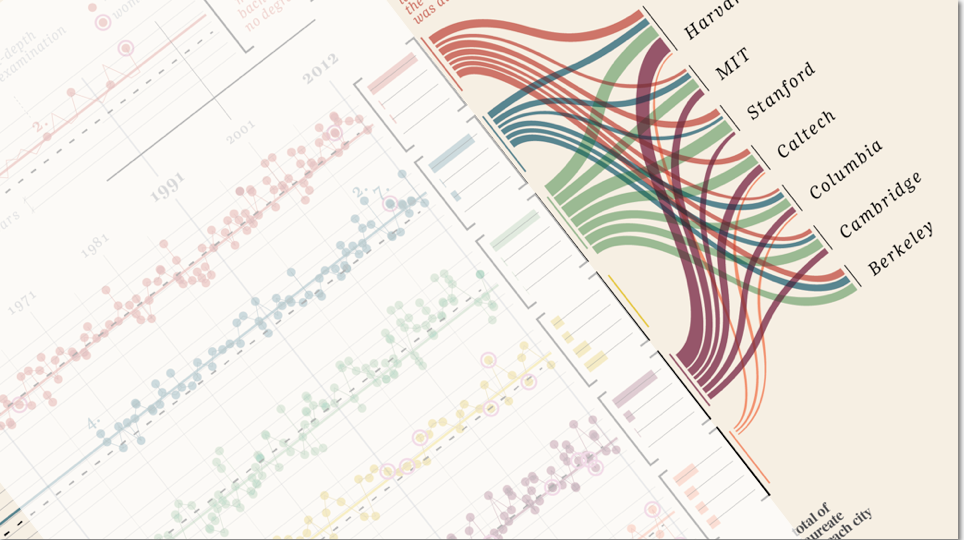
“Design is where science and art break even”
Once in a while I come across some images that takes my breath away, and make me intensely wish that I had thought about it myself. Art can of course do magic, but the combination of information and art, I feel, somehow takes both to a higher level. Giorgia Lupi Has made these amazing charts ...