Category: Networks
Non-hierarchical systems.

Abstracting the map
Tung studio in Toronto decided to reinvent the map. The results are beautiful abstract-ish quilts, showing neighbourhoods as ideas. you could not navigate by these obviously, but they are beautiful, understandably map-ish. My thought is that we do not need paper maps anymore, so we are free to reinvent them as ideas and abstract representation of ...

The network
The network. The most common question I get when people see my drawings are "how long did that take you?!" The next question is "what is it?" Neither question being relevant or interesting. It seems a piece of work is weighted and valued by time and meaning must be figurative. I find this very odd, this need for everything to ...

Games that do science
When the internet was fairly new, a project without precedent set itself to push the limits of what seemed then inconceivable for both science and technology. It was called SETI@Home, and it marked the beginning of a completely new era. SETI's goal was to detect intelligent life outside Earth. To do so, the project collected a ...

Fritz Kahn: the human as industrial palace
(I was horrified to discover that Wikipedia does not have an entry on Fritz Kahn in English. I was utterly unaware of how deep into obscurity this multitalented man had fallen. Update: my pigheaded ability to pester strangers have resulted in an solid entry on Kahn on Wikipedia. Many thanks to Yngvadottir ). man as ...
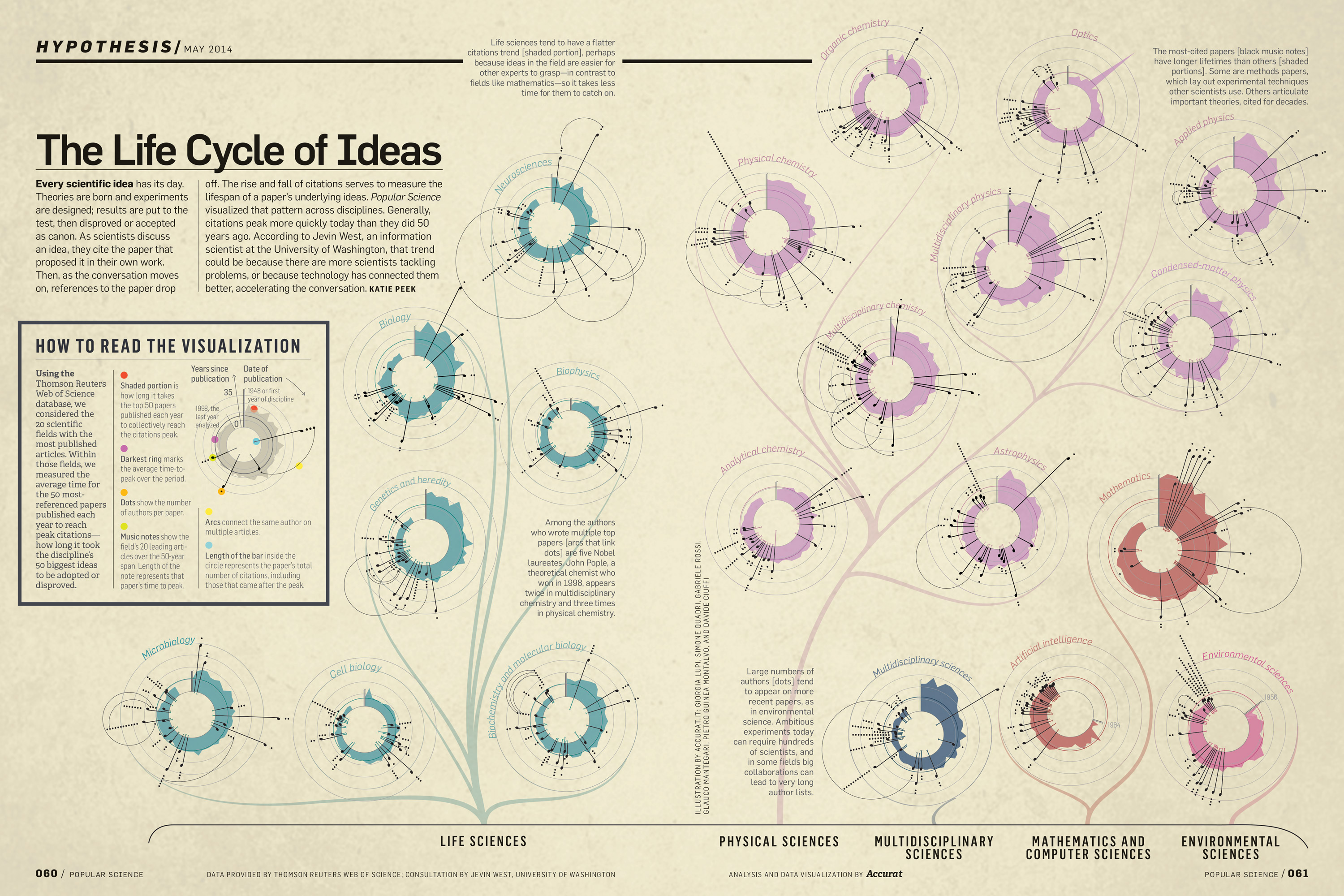
The Life Cycle of Ideas, Accurat for Popular Science
Giorgia Lupi once again comes up with stunning, informative and elegant data visualisation. This time, the life cycle of ideas. You can see another of hers in my post Design is where science and art breaks even ...

David Rumsey collection: mapping history I
David Rumsey's gigantic collection of historical and modern maps, schematics, timelines, data visualisations, diagrams, history, time, sciences, religion is a never-ending source of wonder and inspirations. It is a bit of a trap, as I can spend days wandering around in the magical world of visualisations of history, science, culture, religion. Looking at the older ...
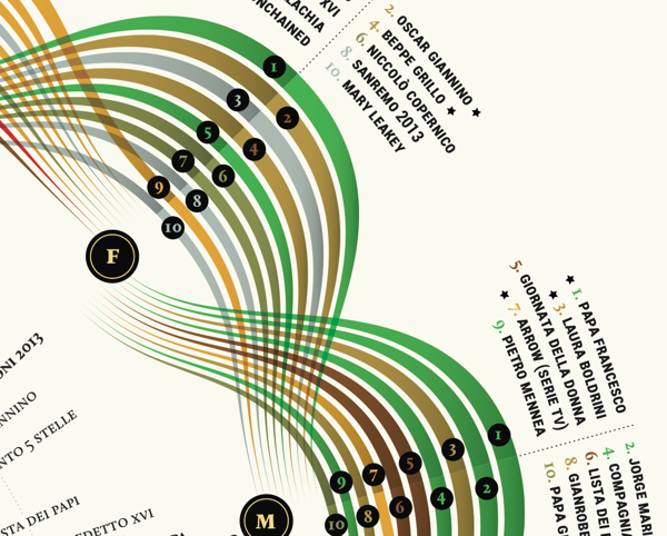
Visual Italian Wikipedia use
I do not read Italian, but I can certainly appreciate these wonderful multivariate visualisations. Valerio Pellegrini made this gorgeous visual representation of Italian Wikipedia use for 2013. Months are distributed clockwise with Italian initial for each month. It has three layers of information and data: the inner level; overall top edits, the second it is ...
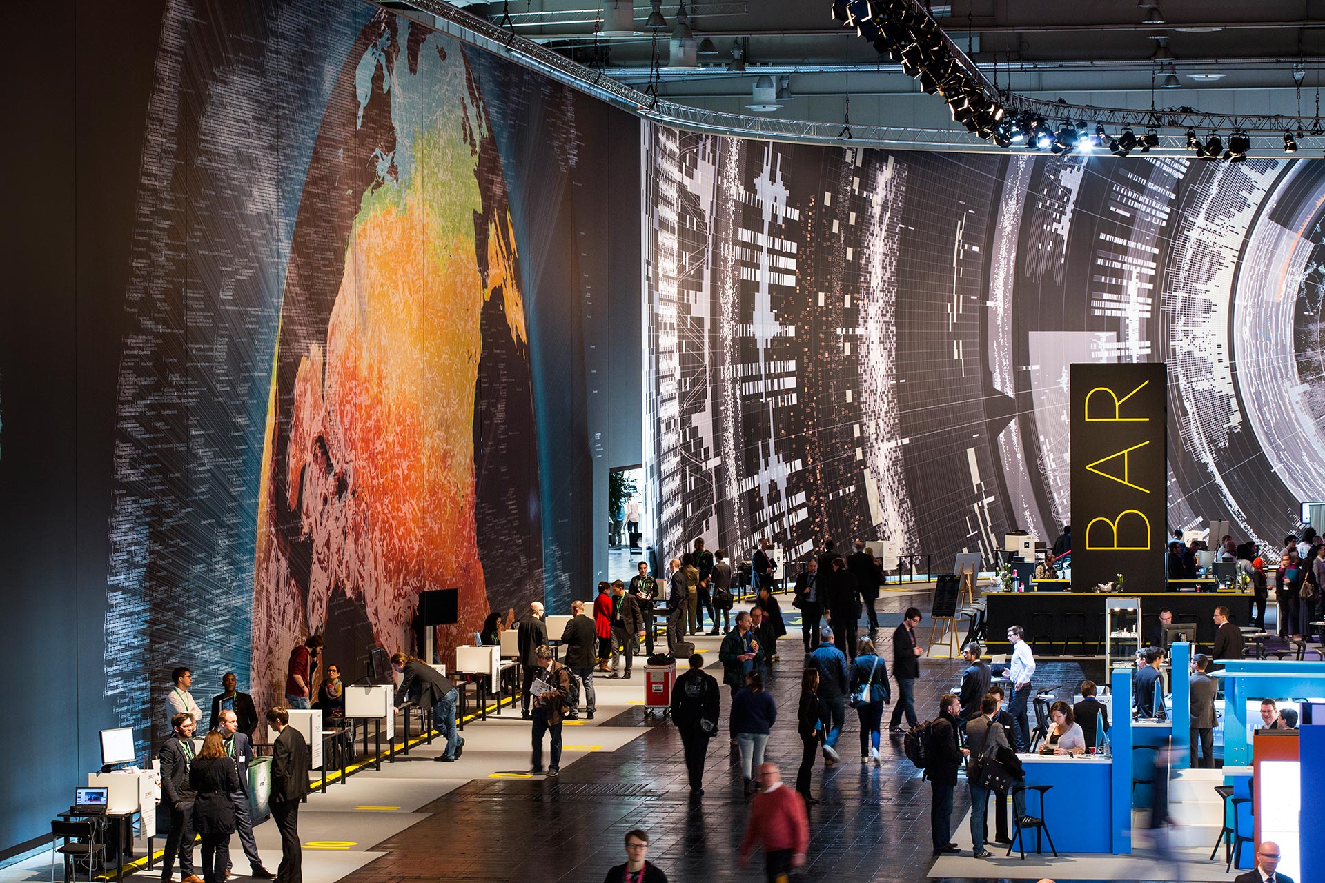
Massive scale, breathtaking data-driven visualisation at CeBit 2014
I sometimes come across data visualisations that takes my breath away. This is one. Created by the design house Kram/Weisshaar for the CeBit 2014 computer expo in Hannover. Wish I was there. It is of course the sheer size that makes an impact, but the visualisations themselves are amazing, the amount of data accessed mindblowing, ...

Visualising data, telling stories
Telling stories that can only be seen. Data visualisations can be extraordinarily beautiful. Here are but a few tools. gephi Open-source desktop application, primarily a network visualisation tool, but with plugins galore for space-time extensions. Gapminder Beautiful, multivariate statistics. See this phenomenal TED presentation by Hans Rosling - love that guy Google charts Not surprising, ...
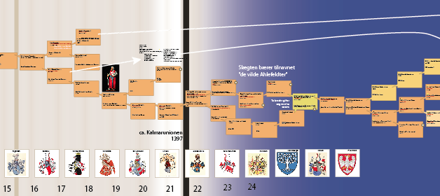
Multivariable visualisation: tracing 40 generations
A while ago, on a whim, i did some digging into my grandmothers family tree. I found more than I bargained for, as described in the post Noble genealogy. And I decided to make a family tree... A family tree of more then five generations soon gets complicated and it becomes impossible to keep track ...

“Next station! Pituitary Gland!”
Over at http://rangelmd.com/ there is this genius post: Human anatomy as subway map ...
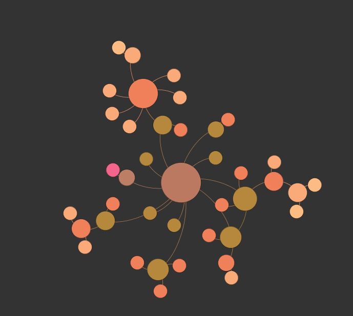
Life network
Take the things that are interesting, and see if you can connect the dots. This is made in Gephi, an open-source network visualisation tool. This will eventually be an interactive browser for my other blog ...

Beautiful statistics
Hans Rosling, the hero of beautiful statistics, showing us the world as it actually is. By making statistics beautiful and demonstrating that the impossible is possible. Oh, and btw; you can play with the Gapminder tool yourself ...
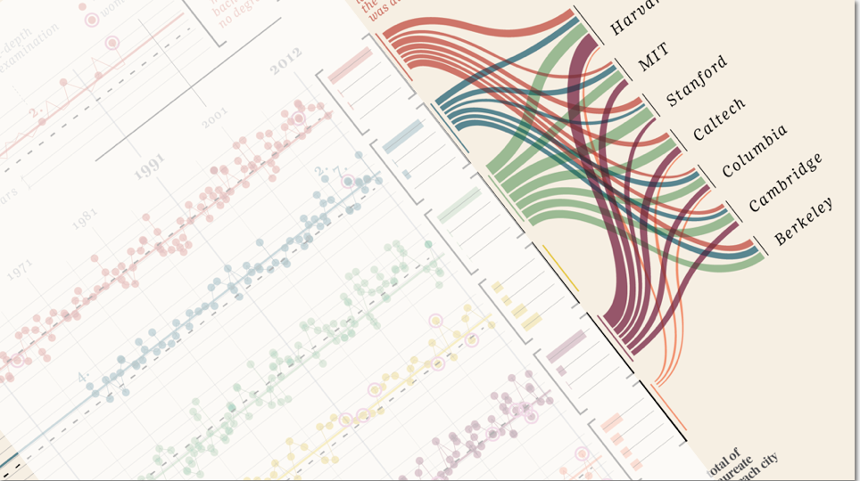
“Design is where science and art break even”
Once in a while I come across some images that takes my breath away, and make me intensely wish that I had thought about it myself. Art can of course do magic, but the combination of information and art, I feel, somehow takes both to a higher level. Giorgia Lupi Has made these amazing charts ...