 If you have ever even remotely been hanging out on with graphic designers, you have come across the logo discussion. Frankly, it is boring, has no answers, and depends on a huge pile of ifs and depends-ons, but the constant fallback is to general guidelines such as clarity, simplicity, it must work on a ballpoint pen and a billboard, only a few colours etc.
Once I was all “stick to the fucking guidelines, they are there for a reason you dimwit!” Now I think it we need a quirkier world. And: these days you do not create a logo and then spend thousands and thousands on printing letterheads, envelopes, business cards. So you can always change it, improve it. It is not a big deal. Yes, it should be a good piece of graphic design, but it is not set in stone; your company is not stuck with it for five years until all the printed material runs out. So loosen up a little!
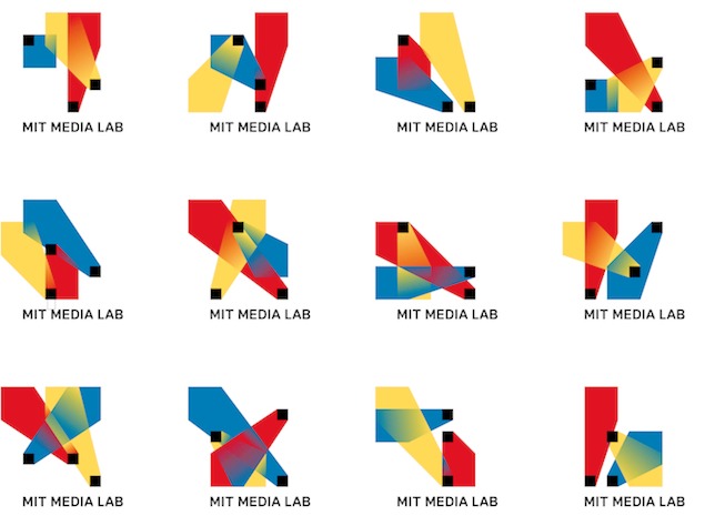
MIT media lab experimented with making algorithmically generated logos, so in practice every employee and student can have their own unique version. It is unmistakable, it might not be the most beautiful thing, but it is a pretty damn cool idea.
Art museums around the world have worked on similar ideas, and the City of Melbourne did a similar thing in 2009. It is pretty cool, yes?
And quirky. I vote for more quirkiness and oddities in the world.
